I spent the better part of the 2010s walking into client homes and covering up every speck of orange I could find.
I hated it.
If I saw a brick fireplace, I wanted to whitewash it. If I saw terracotta tile, I wanted to rip it out. I was obsessed with “Cool Grey” and “Chantilly Lace,” convinced that stripping a home of its visual temperature was the only way to make it feel modern. I was wrong.
We spent a decade living in sterile, grey boxes that felt like Apple store showrooms, and now, collectively, we are desperate for dirt. Not filth, obviously. But earth. We want warmth.
That is why the Terracotta and Sage dynamic has exploded. It isn’t just a trend; it’s a correction. A massive, chromatic overcorrection away from the hospital-grade aesthetics of minimal white and into something that feels like a hug from a moody Italian gardener.
But here is the thing about this combination that nobody tells you on Pinterest: it is incredibly easy to ruin.
If you get the undertones wrong, you don’t get “Tuscan Villa.” You get “1990s Taco Bell.”
Let’s dissect why this works and, more importantly, how to pull it off without your living room looking like a pumpkin patch exploded.
The Science of the “Dirty” Palette
Why do these two specific colors grip us psychologically right now?
It comes down to friction.
Sage is effectively a neutral. It sits in the green family, sure, but a desaturated sage acts as a visual palette cleanser. It calms the nervous system. We know that blue tones help with anxiety relief, and sage carries that same cool, receding energy. It mimics nature’s background noise—foliage, moss, deep water.
Terracotta is the aggressor. It advances. It demands attention. It is baked earth, clay, and iron.
When you put them together, you create a push-pull dynamic. The sage recedes, making the room feel breathable, while the terracotta advances, creating intimacy.
If you look at the trajectory of design lately, specifically the shift toward Japandi and moody minimalism, you see a move away from pure contrasts (black and white) toward tonal contrasts (warm and cool). Terracotta and sage offer high contrast in temperature but low contrast in saturation.
That is the secret sauce. They are both “dusty.” They both feel worn in.
How to execute this without losing your mind
You cannot just buy a red rug and paint the walls green. You need a strategy. I have seen too many DIYers throw paint at a wall and wonder why their studio apartment looks smaller and chaotic.
1. The Ratio is Everything
You have to pick a lane. You need a dominant color.
I swear by the 60-30-10 rule for a reason. In this specific pairing, you cannot do 50/50. If you have equal parts terracotta and sage, your eye won’t know where to land, and the room will feel vibrating and restless.
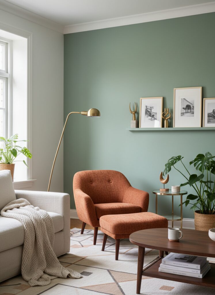
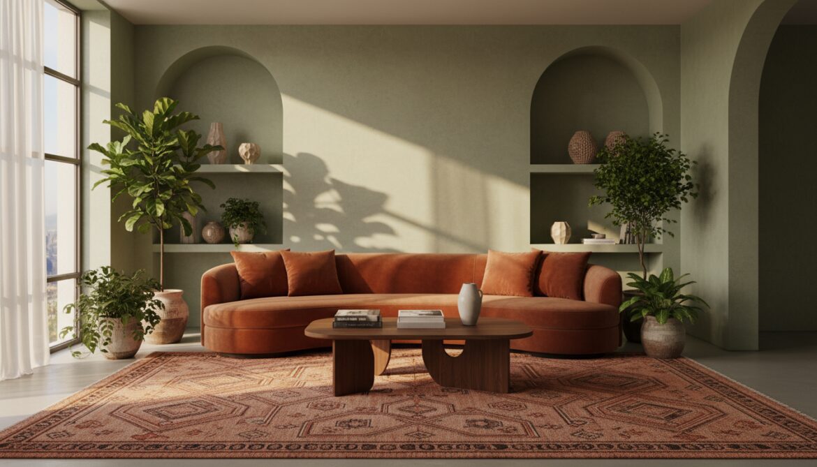
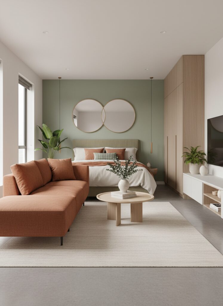
Option A: The Sage Box Use sage as your 60%. Paint the walls, the trim, maybe even the ceiling if you are brave. This creates a cool, biophilic container. Then, bring in terracotta as the 30%—a large velvet sofa, a rug, or heavy drapes. Your 10% accent should be brass or dark walnut wood to bridge them.
Option B: The Clay Cave This is for the moody maximalists. Paint the walls a deep, rusty terracotta (look for “Redend Point” or “Cavern Clay”). This creates a heavy, enveloping atmosphere. Use sage for your 30%—think lush plants, a floating armchair, or cabinetry—to cool the room down so you don’t feel like you’re baking in an oven.
2. Texture Over Pigment
Terracotta is not just a color; it is a material.
If you paint a flat drywall surface bright orange, it looks cheap. It looks like plastic. To make terracotta work, it needs grit.
You should be looking at limewash paints or Roman clay finishes. You need the light to catch the imperfections in the wall. If you are renting and can’t plaster your walls, focus on textiles. A terracotta sofa should be bouclé, velvet, or heavy linen. Never microfiber. Never shiny cotton.
The same goes for sage. A flat sage wall is fine, but a biophilic living wall or a shelf packed with actual plants creates a texture that paint cannot replicate. The variation in the leaves creates shadows that break up the visual weight.
3. The Lighting Trap
This is where 90% of homeowners fail.
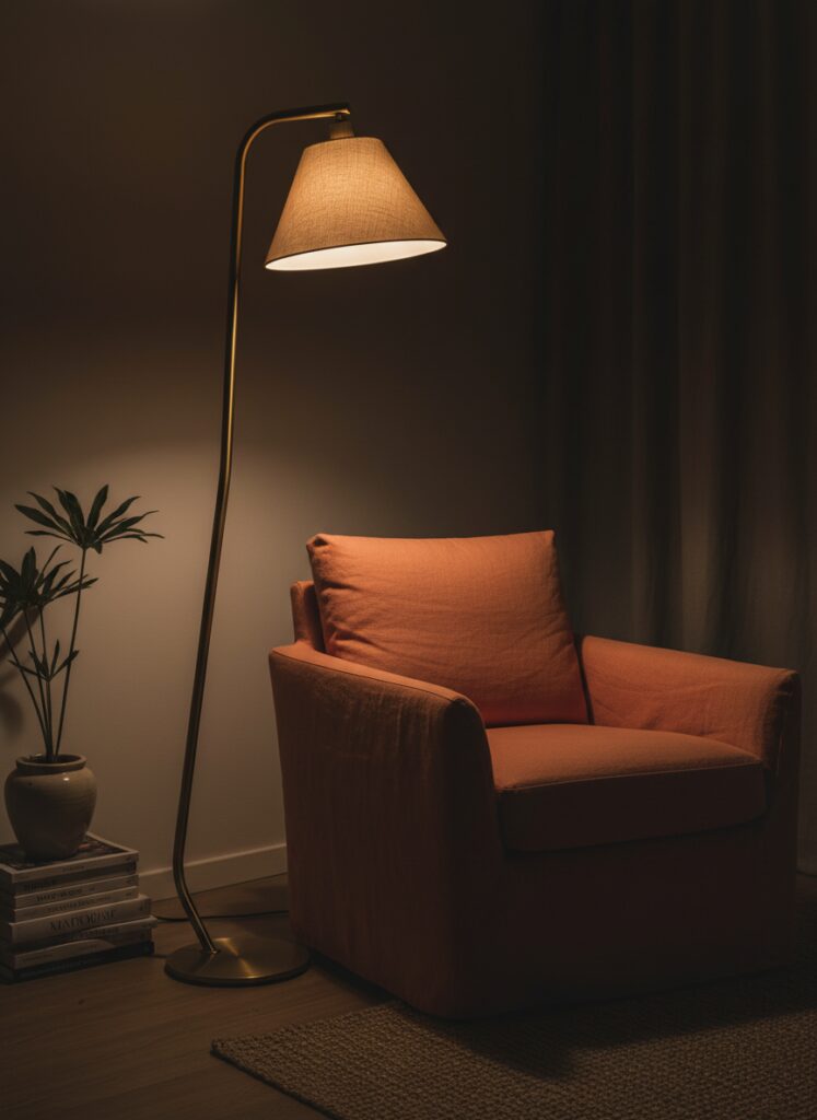
Terracotta changes violently based on your light bulbs.
If you install cool daylight bulbs (anything over 4000K), your beautiful rusty orange is going to turn pink. It will look fleshy. It is gross.
You must control your lightbulb temperature. You need to be in the 2700K to 3000K range. Warm white light reinforces the gold undertones in the terracotta and keeps the sage from turning too grey or sterile.
If you are a renter and you are stuck with awful overhead lighting that you can’t change, ignore the “big light.” Use renter-friendly lighting hacks like plug-in sconces or rechargeable picture lights. Aim warm light specifically at the terracotta elements. If you have a rust-colored armchair, put a warm floor lamp next to it. It makes the color glow rather than flatten out.
4. Furniture Silhouette Matters
Because these colors are organic—literally earth and plant colors—they hate sharp, rigid lines.
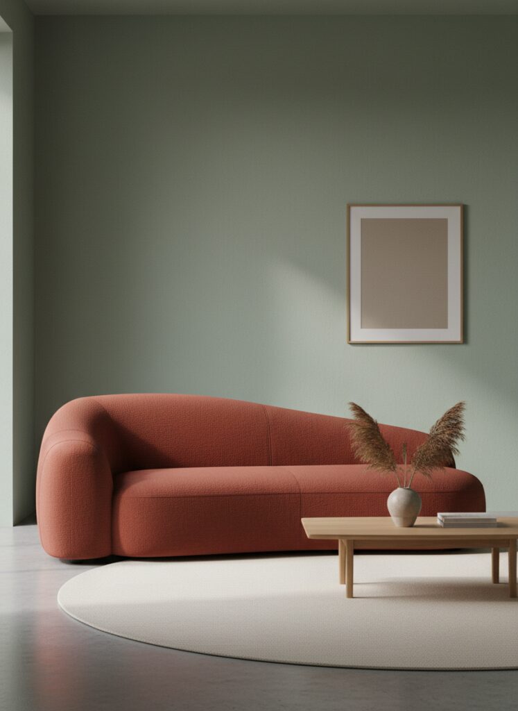
A bright orange square sofa looks like Lego blocks. A rust-colored curved sofa looks like a high-end design piece.
Lean into curved furniture and organic shapes. The softness of a rounded edge compliments the softness of the sage green. If you have a small living room, a round terracotta ottoman or a kidney-bean-shaped coffee table helps the flow. It stops the bold color from feeling aggressive.
If you are working with a broken-plan layout or a weirdly shaped room, use the color to soften the awkward corners. A curved sage armchair in a sharp corner tricks the eye into ignoring the harsh architecture.
Zoning with Color in Small Spaces
I work with a lot of people in apartments who think they can’t use dark colors. That is a myth.
In fact, dark terracotta is one of the best tools for studio apartment micro-zoning.
Let’s say you have one big room. Paint the nook where your bed sits in deep terracotta—ceiling and all. You have instantly created a “bedroom” without building a wall. It feels separate because the color creates a psychological boundary.
Then, keep the living area sage or a warm neutral.
If you are tight on square footage, you also need to think about floor space. A heavy terracotta sofa can look massive. Consider floating furniture arrangements. Pull the furniture off the walls. Put a sage rug down, and let the terracotta furniture sit on it with space around the edges. This negative space prevents the colors from swallowing the room.
Also, use mirrors. But be careful.
Mirrors make a small room look bigger, yes, but they also double whatever they reflect. If you hang a mirror opposite a terracotta wall, you now have two terracotta walls. Make sure your mirror is reflecting the “calm” side of the room (the sage or the window), not the “loud” side.
The Mistakes: Where it goes wrong
I want to save you from having to repaint your house in six months. Here are the screw-ups I see constantly.
1. The “Christmas” Clash
Terracotta is orange-red. Sage is green. If you pick a terracotta that is too red and a sage that is too true-green, your house will look like a year-round Christmas display.
The Fix: You need brown undertones. The terracotta must lean toward brown/rust, and the sage must lean toward grey/silver. If the colors are too saturated, they fight. They need to be “muddy.”
2. Ignoring Wood Tones
You have wood floors or furniture, right? Wood is essentially orange or yellow.
If you have honey-oak floors (very yellow) and you paint the walls a pink-toned terracotta, it will clash. It will look like a bad 1980s remodel.
The Fix: If your wood is warm/yellow, lean your terracotta more toward brown/orange. If your wood is walnut or dark, you can get away with rosier, pinker terracottas. Sage generally plays nice with all wood, which is why it’s a safe anchor.
3. The Clutter Chaos
This color combo is rich. It has a lot of visual weight. If you fill the room with knick-knacks, it feels hoarder-adjacent very quickly.
The Fix: You need to hide your stuff. Utilize vertical storage and paint the shelving unit the same color as the wall. If you have a sage wall, paint the bookshelves sage. This makes the storage disappear and lets the color breathe. This style demands curation, not accumulation.
4. Cheap Fast Furniture
I mentioned this before, but it bears repeating. Bright colors expose cheap manufacturing.
A grey particle-board dresser blends in. A terracotta particle-board dresser screams “I bought this for $40.”
The Fix: If you are on a budget, look for sustainable furniture brands or buy second-hand solid wood and paint it yourself. Solid wood painted sage has a weight and presence that cheap veneer lacks. Or, stick to accessories. A high-quality terracotta ceramic vase is better than a low-quality terracotta armchair.
The Verdict
Terracotta and sage are not going anywhere. We are tired of the cold. We are tired of the grey.
This combination works because it feels innate. It feels like standing in a garden in Tuscany, or Arizona, or frankly, just a really nice backyard.
It is risky. It requires you to commit to color in a way that “Safe Grey” never did. But if you balance your warm and cool temperatures, watch your lighting like a hawk, and aren’t afraid of a little darkness, you will create a home that actually feels like someone lives there.
Go buy some samples. Paint a big square. Live with it for three days. You’ll see what I mean.