The “Sad Beige” Apology Tour
I owe beige an apology.
For the first decade of my career, I rallied against neutral rooms with the fervor of a convert. To me, “monochromatic” was just a fancy designer word for “boring,” or worse, “lazy.” It reminded me of those builder-grade flips where everything—walls, carpet, trim—is coated in the same soul-sucking shade of Greige. It felt sterile. It felt like a dentist’s waiting room where the magazines are three years old and the anxiety is palpable.
I was wrong.
Well, I was half wrong. Monochromatic design is boring, but only if you treat color as the only tool in your box. If you strip away the bright reds and the moody blues, what are you left with?
You are left with the physical reality of the room. The grit. The fuzz. The shine.
When you remove the distraction of high-contrast hues, your eye is forced to look at something else. It starts to read texture as if it were a color. A room painted entirely in white can feel cold and hospital-like, or it can feel like a warm, enveloping cloud you never want to leave. The difference isn’t the shade of paint.
It’s the friction.
Why Flat Rooms Feel “Dead”
Have you ever walked into a room that looked perfect on Instagram but felt weirdly uncomfortable in real life?
It was probably too flat.
Our brains crave sensory input. When we scan a room, we aren’t just looking for safety or exits; we are looking for tactile feedback. We want to know what things feel like without actually touching them.
In a monochromatic space, you don’t have the luxury of using a bright yellow pillow to scream “Look at me!” You have to be subtler. You have to use the interplay of light and shadow to create interest.
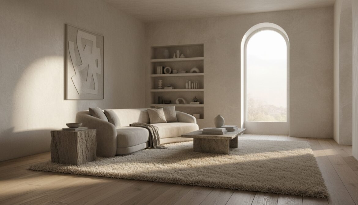
Think about a standard “Landlord Special” apartment. High-gloss white trim, semi-gloss white walls, cheap synthetic carpet. It reflects light evenly. It has no depth. It is visually slippery.
Now imagine that same space, but the walls are a matte limewash. The floor is rough-sawn oak. The rug is a chunky wool loop. The color hasn’t changed—it’s still all “white”—but the room now vibrates. It has a heartbeat.
The secret to pulling off a single-color room without losing your mind is realizing that shadows represent a darker shade of your color.
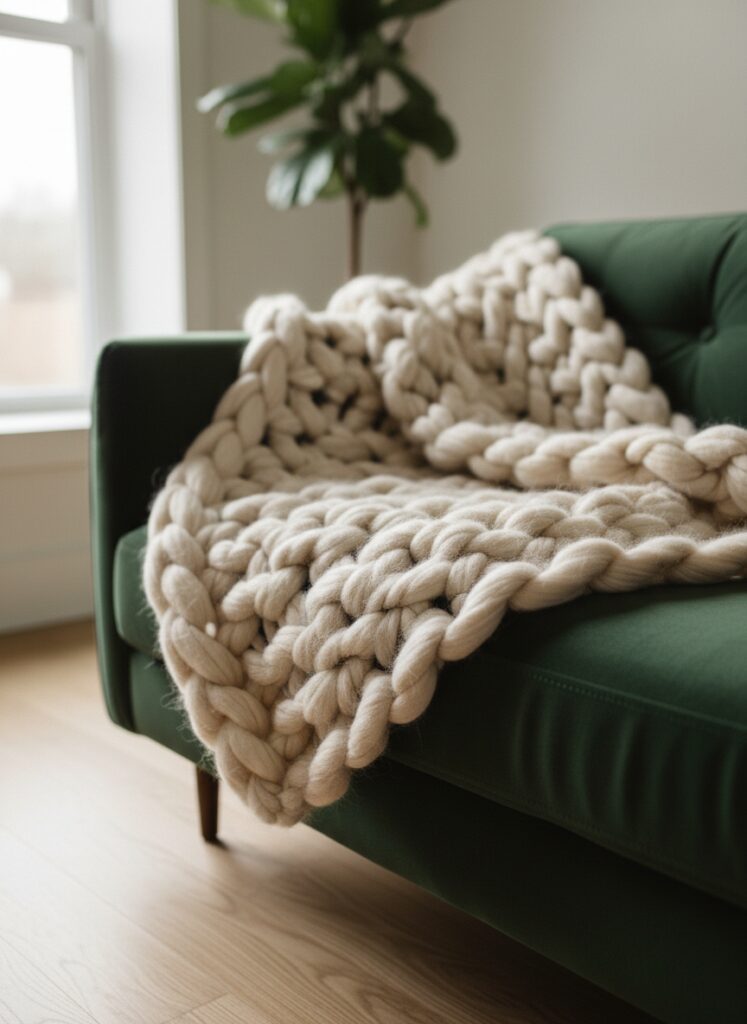
A chunky knit blanket throws tiny, dark shadows within its weave. A velvet sofa catches the light on the curves and goes almost black in the creases. By maximizing texture, you are actually introducing hundreds of micro-variations of your base color.
The Tactile Toolkit: How to Actually Do This
You cannot just buy five things from a big-box store and hope for the best. You have to curate “visual friction.” Here is how I break it down for my clients who want that calm, Japandi-style moody minimalism without the boredom.
1. The 60-30-10 Rule (But for Finishes)
You probably know the classic color rule: 60% main color, 30% secondary, 10% accent. Throw that out the window for a second. In a monochrome room, we need to apply this to sheen and weight.
- 60% Matte/Dull: This is your base. Walls, main upholstery, rugs. Matte absorbs light. It creates a soft, recessive backdrop that feels grounded. If your walls are shiny, the room feels anxious.
- 30% Natural/Rough: This is the wood grain, the stone, the rattan, the brick. These elements stop the eye. They provide the “grip.”
- 10% Shine/Gloss: This is the jewelry. A brass lamp base, a mirror, a glass vase. You need a tiny bit of reflection to bounce light around, or the room feels like a cave.
If you mess up these ratios—say, 50% gloss and 50% matte—the room feels chaotic. It looks cheap.
2. Lighting Is Not Optional
I cannot stress this enough: You cannot see texture in the dark.
More specifically, you cannot see texture with flat, overhead lighting. The dreaded “boob light” flush mount in the center of your ceiling flattens everything. It blasts light downward, erasing those precious shadows we talked about.
To make texture pop, you need side lighting.
You need floor lamps that cast light across a wall, highlighting the bumps in your plaster or the weave of your wallpaper. You need table lamps with warm bulbs. Speaking of which, the temperature of your lightbulb makes or breaks this look. If you use a cool, blue-tinted daylight bulb (5000K), your cozy cream room will look like a morgue. The texture will look harsh and gritty rather than soft and inviting. You need warm white light (2700K-3000K) to soften the edges of those shadows.
3. “Gritty” Materials and Biophilia
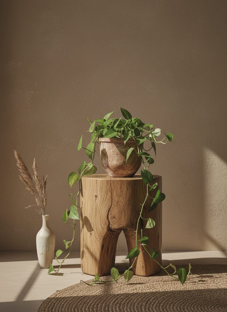
If you are renting, you might be stuck with flat drywall. That is fine. You create the architecture with your furniture.
This is where the concept of “bringing the outdoors in” actually becomes useful rather than just a buzzword. Natural materials are inherently imperfect. A piece of sustainable, solid wood furniture has grain patterns that no machine can replicate perfectly. Those imperfections are the “texture color.”
Living walls or just a massive amount of plants are the ultimate textural hack. A fiddle leaf fig or a trailing pothos adds a chaotic, organic shape that breaks up the rigid straight lines of a room. Even if you are doing an all-black “goth” room or a deep terracotta sanctuary, the green of the plants acts as a textural neutral.
4. The Shape of Sound
Sound has texture? Yes. But I am talking about visual sound—the rhythm of the room.
If everything in your monochrome room is square—square rug, square sofa, square coffee table—it feels rigid. It feels like a prison cell.
You need to introduce curved furniture.
A round ottoman or a kidney-bean-shaped sofa forces the eye to travel in a meandering line rather than a sharp zigzag. In a room lacking color contrast, the silhouette of your furniture becomes the main character. If you float your furniture away from the walls (even in a small living room), you create negative space that allows those shapes to breathe.
Seeing the legs of a chair and the floor continuing underneath it adds depth. If you shove a blocky sofa against a wall, you have created a solid, heavy lump. Pull it out. Let the light hit the back of it.
5. Textiles: The Layering Game
Do not buy a matching set of throw pillows. Just don’t.
If your sofa is velvet, your pillows should be linen. If your sofa is a rough tweed, get a silk or faux-fur pillow.
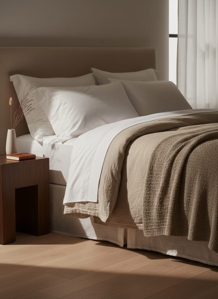
Think about bedding. The most luxurious beds aren’t the ones with the highest thread count; they are the ones with layers. A percale sheet (crisp), a linen duvet (wrinkled, soft), a chunky wool throw (heavy). Even if they are all the exact same shade of “Sage Green,” the bed looks expensive because the light hits the linen differently than it hits the wool.
This applies to window treatments too. A bamboo shade layered under a sheer curtain adds a “grid” texture behind a “flowy” texture. It is visually delicious.
Where People Screw This Up (The Danger Zone)
I have seen many DIY attempts at monochrome end in tragedy. It usually looks like someone exploded a paint can and walked away.
Mistake #1: The “Matchy-Matchy” Trap You take a paint chip to the furniture store and try to find a sofa that matches the wall exactly. Then you find a rug that matches the sofa exactly. Result: The room looks like a blob. You lose all definition. The Fix: You need tonal variation. If your walls are a light blue meant for anxiety relief, your sofa should be a navy or a dusty grey-blue. Your rug should be a patterned mix of both. You want cousins, not twins.
Mistake #2: Ignoring the “Undertone” White is never just white. It is blue-white, yellow-white, or pink-white. Grey is never just grey. It is purple-grey or green-grey. Result: You paint the walls a warm, creamy white, but buy a “cool grey” sofa. Suddenly, the walls look like nicotine stains and the sofa looks like dirty ice. The Fix: You have to carry the swatch. Put the materials next to each other in natural light. If the undertones clash, the monochrome effect fails instantly.
Mistake #3: Forgetting the Mirrors In a small room, especially a studio apartment where you are trying to create “zones” without walls, people forget about reflection. Result: The texture feels heavy and oppressive because the room feels small. The Fix: Mirrors duplicate your texture. A large mirror reflects that beautiful gallery wall or that textured weaving, effectively doubling the “color” in the space without closing it in. It creates a “fake” depth that tricks the eye.
Mistake #4: The “Showroom” Syndrome You buy everything new, all at once, from one collection. Result: It looks flat because everything has the same manufactured finish. The Fix: You need something old. You need a vintage wooden stool with scratches on it. You need a beat-up leather chair. The wear and tear is the texture. It breaks the pristine, plastic feel of modern “fast furniture.”
Making It Work for Renters
I know what you are thinking. “I can’t plaster my walls.”
True. But you can control what hangs on them.
If you are stuck with white walls, use vertical storage to add texture. Open shelving with books (turn the spines in for a neutral look, or out for chaos—your call) creates a wall of texture.
Use a fake entryway divider made of wooden slats or an open bookshelf. The light passing through the slats creates a striped shadow pattern on the floor that changes as the sun moves. That is free decor. That is dynamic texture.
Don’t ignore the floor. If you have ugly rental carpet, layer a large, flat-weave rug over it (yes, rug on carpet is allowed), and then a smaller, thicker rug on top. It distracts the eye.
The Bottom Line
Color is easy. Color is a shortcut. You paint a wall red, and boom—it’s energetic.
Texture is harder. It requires patience. It requires you to touch things, to look at how a fabric drapes, to notice how a lightbulb changes the grain of wood.
But when you get it right? It is infinitely more sophisticated. It is a space that doesn’t just look good; it feels good. It wraps around you.
So, stop worrying about finding the perfect “Pop of Color.” Focus on the pop of a weave. Focus on the rough against the smooth. That is where the real design happens.
Go touch some fabric.