The “Safe” Choice is Actually Stressing You Out
I used to be a chronic apologizer for the “All-White Everything” aesthetic.
For years, I told clients that if they wanted peace, they needed to strip color away until their living room looked like an art gallery before the art arrives. I was wrong. I was lazy.
Living in a white box doesn’t make you feel calm; it makes you feel watched. It makes you feel like you are waiting for a spill, a smudge, or a shadow to ruin the pristine void you’ve spent thousands of dollars curating. It is high-maintenance minimalism that demands your constant vigilance.
That isn’t relaxation. That is a part-time job as a janitor in your own home.
Real anxiety relief doesn’t come from the absence of color. It comes from the presence of the right one. And after fifteen years of swatching walls and watching trends die, I can tell you with absolute certainty that blue is the heavy lifter. It is the only color that manages to be moody without being depressing, and bright without being manic.
If you are trying to lower your cortisol levels, stop buying “Chantilly Lace” and pick up a paint chip that actually has some pigment.
The Biology of Why Blue Works (It’s Not Just “Vibes”)
Why does this specific section of the color spectrum hijack your autonomic nervous system and force it to chill out?
It’s evolution. It’s biology.
For the vast majority of human history, the color blue signaled resources. It meant water. It meant a clear sky free of storms. We are hardwired to look at blue and think, “Okay, I am likely to survive the next 24 hours.”
When you paint a room blue, or anchor a space with a massive indigo sofa, you are hacking that primitive part of your brain.
Red screams danger (blood, fire, poisonous berries). Yellow screams attention (sunlight, bees, caution tape). But blue? Blue is the visual equivalent of a weighted blanket.
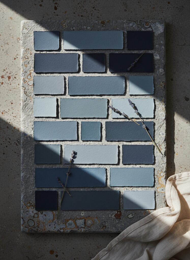
Research in color psychology consistently shows that exposure to blue wavelengths can lower blood pressure and reduce heart rates. But there is a caveat. You cannot just slap “Bluebird Bright” on the walls and expect a spa day. The shade dictates the emotion.
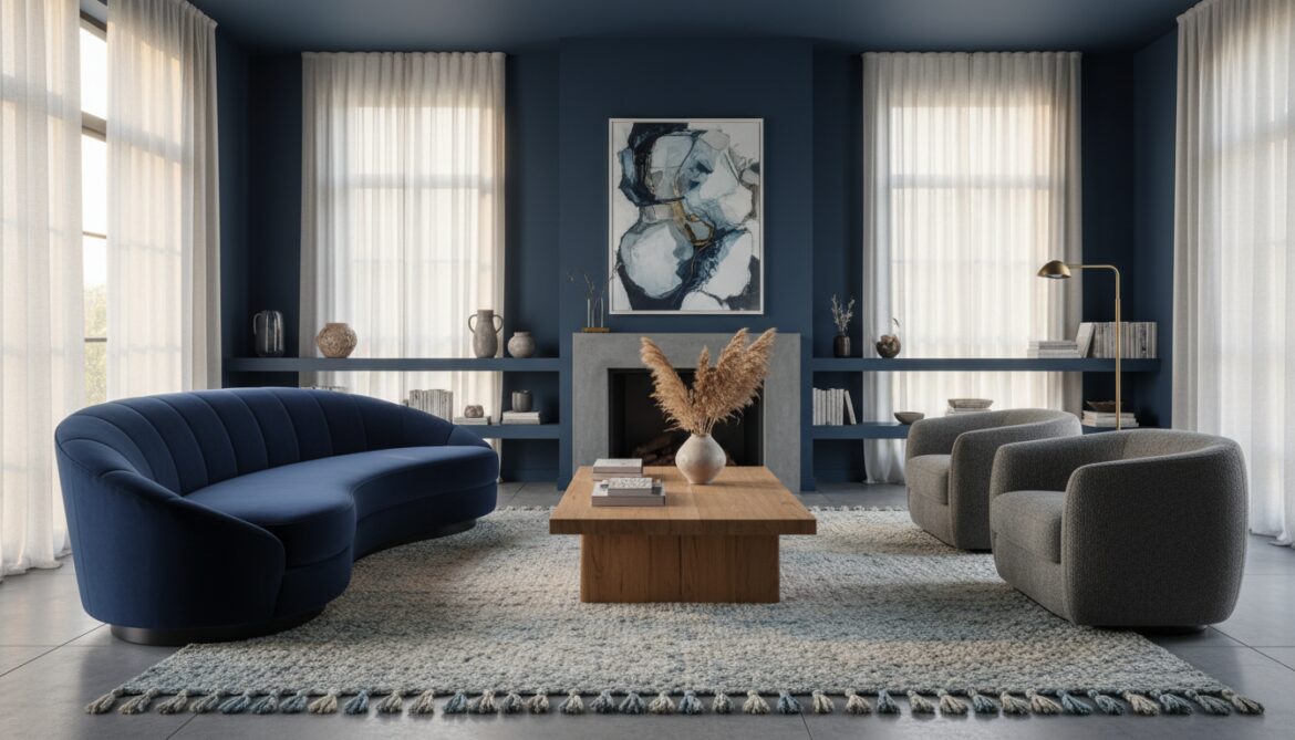
High-saturation, electric blues are energetic. They vibrate. They are terrible for anxiety. You want the muddy blues. The grey-blues. The deep, oceanic navies that feel like the bottom of the sea where everything is quiet and the pressure holds you together.
How to Actually Execute This Without It Looking Like a Nursery
Here is the hard truth: Blue is easy to buy, but difficult to master. If you aren’t careful, your sophisticated living room will end up looking like a toddler’s bedroom or a sad dentist’s waiting room.
You need a strategy.
1. Master the Ratio, Don’t Drown in It
Novices paint all four walls the same color and call it a day. That’s fatigue, not design.
You need balance. I swear by the standard color proportion rules here because they prevent you from going overboard. If you decide your walls are going to be a deep, moody slate blue, that is your 60 percent. That is the dominant force.
You cannot then put a blue sofa and a blue rug in there. You will suffocate.
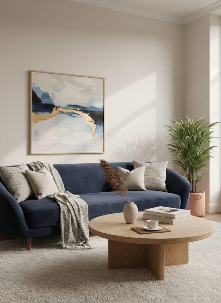
You need to break that intensity with a secondary color—maybe a warm oat or a natural wood tone—for your furniture (the 30 percent). Then, use your final 10 percent for a sharp accent, like brass hardware or a burnt orange throw pillow. This structure stops the room from feeling like an aquarium and makes it feel like a designed space.
2. The Shape of Calm
Color is only half the equation. If you paint a room a soothing navy but fill it with jagged, angular furniture, you are sending mixed signals to your brain. Sharp corners signify a threat; they are things you can bang your shin on.
To maximize the anxiety-reducing effects of blue, pair it with organic forms.
Think about a curved sofa in a rich velvet or a round coffee table. The softness of the furniture mimics the fluidity of water, reinforcing the psychological impact of the blue walls. This creates a flow that feels natural rather than manufactured. When the eye can glide over a room without getting snagged on a sharp edge, the brain relaxes.
3. Texture is the Antidote to “Cold”
Blue is inherently a cool color. If you pair blue walls with sleek metals, glass, and polished concrete, you are building an ice box. It will feel clinical.
To fix this, you have to layer in textures that feel warm and messy.
I’m talking about “Japandi” sensibilities here—where the rustic meets the modern. If you have a dark blue wall, place a rough-hewn wooden console table against it. The warmth of the timber cuts through the coolness of the paint. Use bouclé, wool, or linen. The goal is to create a moody minimalism where the space feels stripped back but still cozy enough to nap in.
4. Zoning for Sanity in Small Spaces
If you live in a studio or a small apartment, you might be terrified of dark colors. People constantly repeat the lie that “dark colors make rooms look smaller.”
They don’t. They make boundaries disappear.
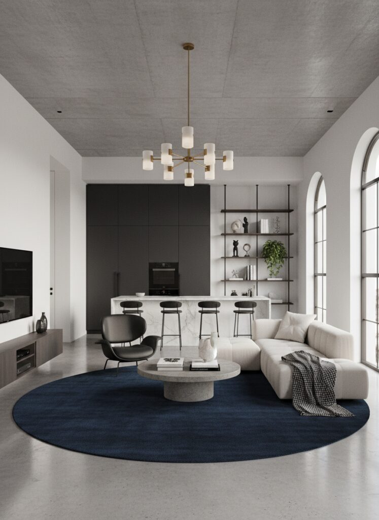
In a small footprint, you can use blue to define zones without building walls. This is crucial for “broken plan” living, where you need separation between your work life and your relax life but don’t have the square footage for doors.
Try “floating” your furniture arrangement on a large, deep blue rug to visually separate the living area from the kitchen. Or, paint just the sleeping alcove a deep midnight blue. This creates a psychological trigger: when you step into the blue zone, work is over. It is time to sleep. This micro-zoning creates order in a chaotic floor plan, and order reduces anxiety.
5. Bring the Outside In (Literally)
Blue implies nature, so you need to back it up with actual nature.
Biophilic design isn’t just a buzzword; it’s the partner blue needs. The most natural pairing on earth is blue (water/sky) and green (plants). A deep teal wall serves as the perfect backdrop for a living wall or just a really aggressive amount of potted ferns.
The green pops against the blue, creating depth and life. If you can’t keep plants alive, use dried florals or botanical prints. Just don’t let the blue stand alone without organic company.
The “Mistakes” Section: How to Ruin It
I have seen people try this and fail miserably. Usually, it is because they ignore the technical side of interior design. Here are the three ways you will mess this up.
The Lighting Temperature Disaster
This is the number one killer of blue rooms.
Paint serves as a filter. It reflects light. If you paint your room a beautiful, grayish-blue and then screw in “Daylight” (5000K) or “Cool White” bulbs, your room will look like an operating theater. The blue will turn harsh, clinical, and icy.
You must understand lightbulb temperature. For blue to feel cozy and anxiety-relieving, you need to blast it with warm light (2700K to 3000K). The yellow warmth of the bulb mixes with the blue paint to create a complex, muddy tone that feels expensive and wrapping.
If you are a renter and stuck with awful overhead lighting that you can’t change, stop using the big light. Seriously. Use floor lamps and table lamps with warm bulbs to control the vibe. Renter-friendly lighting hacks, like using puck lights in sconces or smart bulbs, are the only way to save a blue room from feeling like a refrigerator.
The Clutter Catastrophe
Blue is a heavy visual weight. It draws the eye.
If you have a blue accent wall or a blue room, and it is covered in clutter, the anxiety relief is gone. The background is demanding attention, and the clutter is demanding attention. It creates visual noise.
You need to be aggressive with vertical storage. Get the junk off the floor and behind doors. Use tall cabinets painted the same color as the walls so they disappear. If you have a small room, use mirrors strategically to bounce light around, but ensure the mirror isn’t just reflecting a pile of laundry.
A blue room works because it feels serene. If you fill it with knick-knacks, you are fighting the color.
The “Fake” Entryway Fail
Many people walk right into their living room from the street. There is no transition, no moment to decompress. They try to paint the whole room blue to calm down, but the energy of the front door bleeds into the sofa area.
You need to create a pause.
Even if you don’t have a foyer, you can fake an entryway using furniture placement or a partial paint block. Paint the area by the door a different shade or use a divider. Let the “Blue Zone” start only where the relaxation happens. If you treat the whole house as one big mush of color, you lose the psychological trigger that tells your brain, “I am in the safe spot now.”
Why This Matters
We spend too much time trying to make our homes look impressive to guests who visit twice a year, and not enough time making them livable for the person who pays the mortgage.
You do not need a beige living room to have a resale-ready home. You need a home that lowers your heart rate when you walk through the door after a commute that made you question your life choices.
Paint it blue. Buy the navy velvet couch. Turn the lights down low.
Your nervous system will thank you.