I have a confession to make, and it might get me kicked out of the “trendy design” club.
I am exhausted by gallery walls. Truly, physically exhausted.
For a decade, I preached the gospel of the “curated grid.” I told you to collect postcards, vintage sketches, and abstract prints, then painstakingly arrange them into a coherent puzzle. But let’s be real for a second. Have you ever tried to dust a gallery wall? It is a nightmare of crooked angles and shifting frames. You walk past it, brush a shoulder against a portrait, and suddenly the whole geometry is off. It feels chaotic. It feels like visual noise.
And frankly, it screams “2015 Pinterest.”
We are moving toward something quieter. Something heavier. The era of covering every square inch of drywall with small, disjointed imagery is ending. In its place, we are seeing a shift toward Intentional Isolation. This isn’t just about minimalism; it is about confidence. It is the design equivalent of speaking softly so people have to lean in to listen.
The Shift to “The Solitary Hero”
Why does this shift matter? Because our eyes are tired.
We are bombarded with micro-content all day on our phones. Scrolling, tapping, flickering images. When you come home, your walls shouldn’t replicate that chaotic feed. A gallery wall forces the eye to dart around, scanning for a focal point that doesn’t exist.
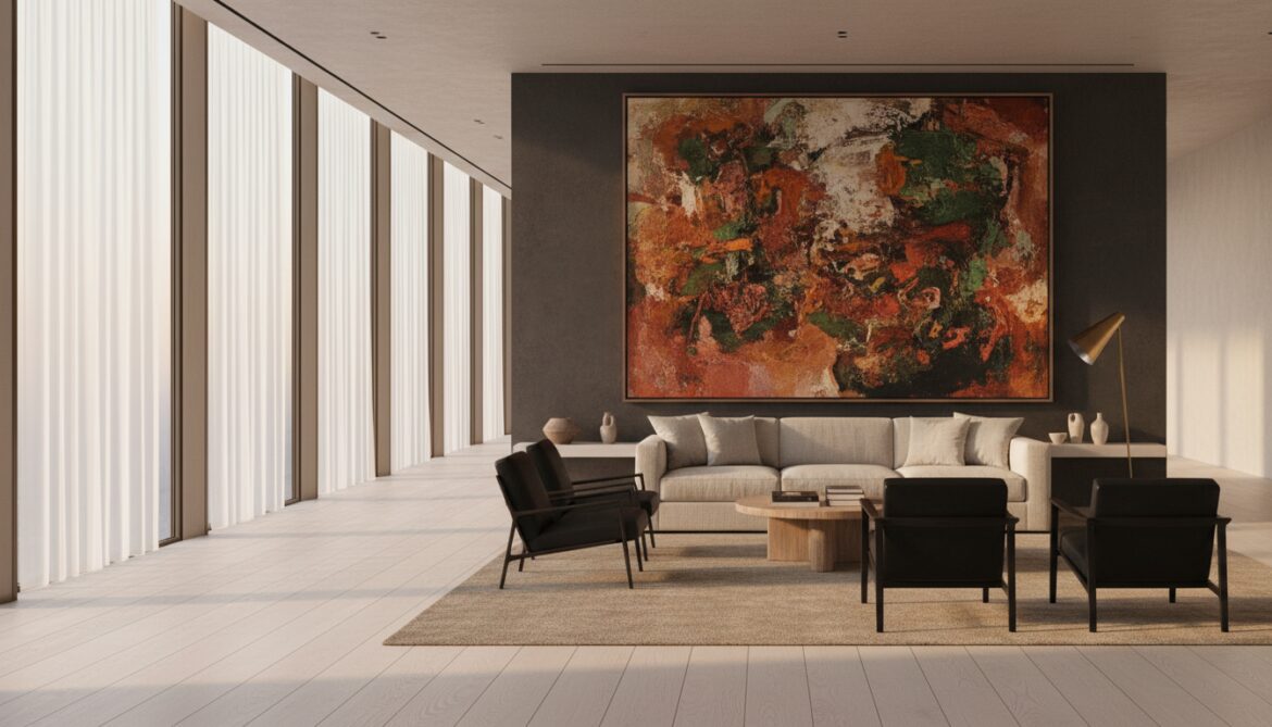
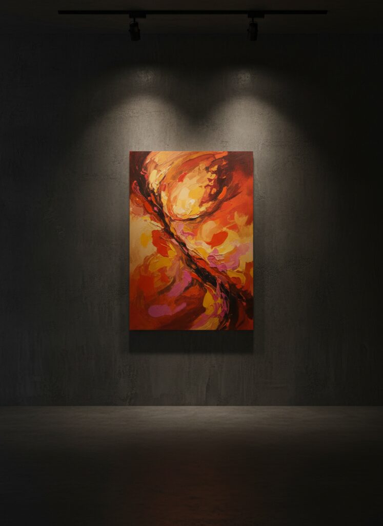
The new approach for 2026 focuses on the Solitary Hero. This is one large, commanding piece that anchors the room. It demands attention not because it is loud, but because it is singular.
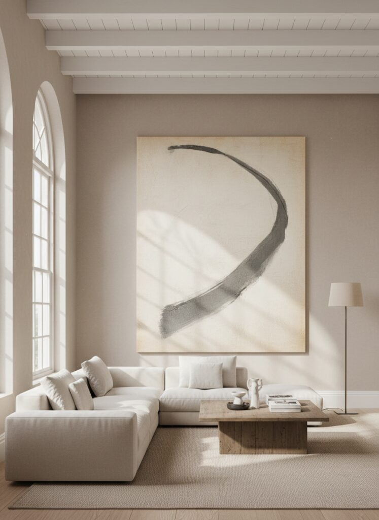
Think about the psychology of space. When you enter a room with one massive, floor-to-ceiling canvas, your brain instantly categorizes the space as “calm.” It creates a sense of order. This is particularly effective if you are dealing with anxiety; blue-toned, large-scale abstract pieces can actually lower your heart rate, whereas a cluttered wall of red and yellow prints might spike it.
How to Execute the Look (Without Spending a Fortune)
You might be thinking, “Great, but a 4-foot canvas costs more than my rent.”
It doesn’t have to. You just have to stop shopping at big-box stores and start thinking like a scenographer. Here is how you pull off the large-scale look, specifically tailored for real homes with real budgets.
1. The “Lean” Technique for Renters
If you are renting, you know the panic of the security deposit deduction. Gallery walls turn your plaster into Swiss cheese. The solution? Don’t hang the art.
Get a massive frame—I’m talking mirror-sized—and lean it against the wall. This works exceptionally well in living rooms with floating furniture layouts. By placing a large piece of art on the floor behind a floating sofa, you ground the furniture so it doesn’t look like it’s drifting in the middle of the room.
Safety note: If you have pets or kids, anchor the top to the wall with a heavy-duty furniture strap. It’s invisible, but it keeps the “lean” from becoming a “crash.”
2. Texture is the New Image
We used to obsess over the subject of the art. Now, we care about the texture.
Visuals are flat; homes are 3D. Instead of a print behind glass, look for fiber art, woven tapestries, or even architectural salvage. I’ve seen incredible results using vintage rugs mounted as wall hangings. This serves a dual purpose. Aesthetically, it adds depth that a poster never could. Functionally, it dampens sound. If you are working from a home office and dealing with echo during Zoom calls, a thick, textural piece behind you absorbs that reverb better than acoustic foam (which is ugly) ever could.
This also ties into the “Japandi” evolution we are seeing. It’s no longer just stark white and oak; it’s moody, tactile, and raw. A rough-hewn piece of wood or a canvas slathered in joint compound and painted the same color as the wall creates a shadow play that changes as the sun moves across the room.
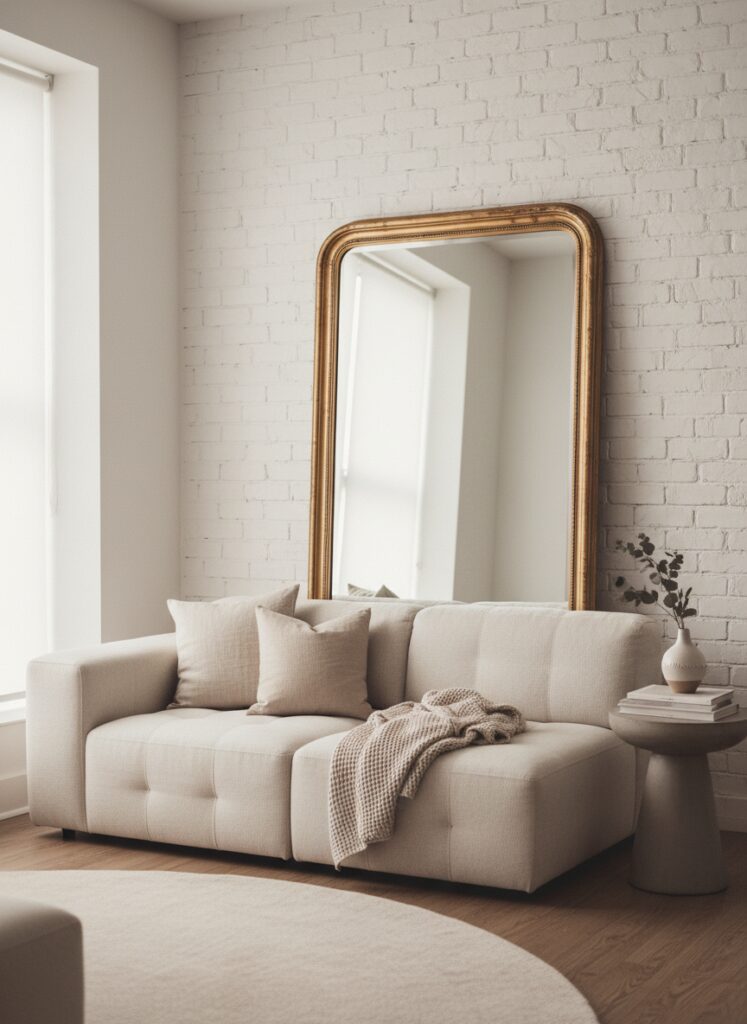
3. The Mirror Trick for cramping spaces
If you are dealing with a small footprint, art might not even be the answer. A mirror is. But not a dinky rectangle.
I am talking about a mirror that mimics a window. If you have a studio apartment or a boxy bedroom, a massive mirror placed opposite a light source effectively doubles your square footage visually. It bounces light into dark corners.
However, don’t just buy a cheap plastic mirror. Go thrifting. Look for quality wood frames. You want something with weight. If you find a solid wood frame with a broken mirror, buy it anyway. Replacing the glass is cheap; finding a frame with that kind of character and joinery in a modern store is nearly impossible.
4. The “Dark Mode” Backdrop
Here is a controversial take: Art looks terrible on white walls.
Okay, maybe not terrible, but it looks generic. If you want your art to pop, paint the wall behind it a dark, moody color. A sage green, a terracotta, or even a deep charcoal. When you place a piece of art on a dark wall, the frame disappears, and the image projects forward. It feels cinematic.
This is especially effective if you have low ceilings. By painting the walls and the ceiling the same dark hue and hanging a vertical piece of art, you blur the boundary where the wall ends and the ceiling begins. Your eye travels up the art and gets lost in the dark void above, tricking your brain into thinking the room is taller than it is.
For more about this topic, read: How to Make Low Ceilings Look Higher
5. Lighting Is The Frame
You can buy a Picasso, but if you light it with a single 6000K “daylight” bulb in the center of the room, it will look like a poster in a dentist’s office.
Lighting is the silent frame. If you are investing in a large statement piece, you must invest in a spotlight. This doesn’t require an electrician. Battery-operated picture lights have become surprisingly good. Or, use a smart bulb in a directional floor lamp.
Set the temperature to warm white (2700K to 3000K). This warmth pulls out the reds and yellows in wood frames and canvas, making the piece feel expensive. If you use cool, blue-tinted light, the art will feel sterile and commercial. You want your home to feel like a lounge, not a laboratory.
Integrating Tech and “Utility” Art
We have to address the black rectangle in the room. The TV.
For years, we tried to hide TVs in gallery walls. It never worked. The TV was always the black sheep. In 2026, we are smarter. If you have a projector setup, your wall is the art. When the movie is off, that blank wall is negative space, which is restful. When it’s on, it’s dynamic.
If you have a standard TV, stop trying to blend it in. Treat it as a piece of furniture. Or, use the “Frame” concept where the TV displays art when idle. But here is the trick: don’t use the stock photos. Upload digitized versions of vintage oil paintings. The texture of the digital brushstrokes combined with the matte screen creates a convincing illusion.
And what about the clutter that comes with tech? Smart speakers, modems, cables. Don’t let them sit on the console table under your beautiful new art. Hide them. Use hollowed-out vintage books or woven baskets on a shelf nearby. Your eye should go to the art, not the blinking router lights.
Where People Get It Wrong (The Danger Zones)
Even with the “Solitary Hero” concept, things can go sideways. Here are the three mistakes I see consistently.
1. The “Postage Stamp” Effect This is the most painful one to watch. Someone buys a standard 18×24 inch poster for a large sofa wall. It looks like a postage stamp on an envelope. It creates an uncomfortable imbalance. The Rule: The art should cover roughly two-thirds of the width of the furniture it hangs above. If your art is too small, either get a bigger frame with a massive mat (which adds luxury) or don’t hang it there.
2. The High-Hang Why do people hang art so high? Unless you are 6’8″, stop hanging your art at standing eye level for a giant. The Fix: The center of the artwork should be 57 to 60 inches from the floor. If it’s above a sofa, leave 6 to 8 inches of clearance above the back of the couch. If you hang it closer to the ceiling than the furniture, the art feels like it’s floating away, unconnected to the rest of the room.
3. Ignoring the Color Balance Buying art just because you “like it” is fine, but if it clashes with your 60-30-10 color rule, the room will feel off. If your room is monochromatic beige and wood, dropping a neon pink pop art piece in the middle can work, but it takes extreme skill. The Better Path: Pick art that pulls a minor accent color from your rug or throw pillows. It creates a thread of continuity that makes the room feel designed, not just decorated.
A Final Thought on “New”
Trends are cyclical. I know that in five years, I might be writing an article about how “Maximalist Clutter is Back.”
But for right now, look at your walls. Do they make you feel calm? Or do they make you feel like you have a to-do list of straightening frames?
If it’s the latter, take them down. Patch the holes. Find one beautiful, gritty, oversized piece of art—something that looks like it has a history—and let it stand alone. Give your eyes a break. You deserve a home that doesn’t demand your constant attention.
Go find your hero piece. Just make sure it fits in the car before you buy it.