The “Anti-Hook”: Let’s Be Honest About the Hairpin Legs
I’m going to say something controversial. I am arguably exhausted by Mid-Century Modern (MCM).
If I see one more cheaply made, knock-off Eames chair in a dentist’s waiting room or a flimsy particle-board console table with wobbly hairpin legs, I might scream. It’s everywhere. It’s the pumpkin spice latte of interior design. Over-consumed. Often diluted.
So why, after 15 years in this industry, is my own living room still anchored by a low-slung walnut credenza?
Because despite the oversaturation, the mass-market watering down, and the “Mad Men” cosplay, the core philosophy of Mid-Century Modern design is bulletproof. It works. It solves problems. It solved them in 1955, and it solves them even better in 2024.
We don’t love it just because it looks “retro.” We love it because it’s the most logical, functional, and forgiving design language ever invented.
The Meat: Why The Obsession Won’t Die
To understand why we can’t quit MCM, you have to look at the mess of the world it was born into.
It was 1945. The war was over. Soldiers were coming home, families were exploding in size, and housing was getting smaller. Sound familiar? We are currently living in an era of shrinking square footage and chaotic global events. We crave order.
MCM wasn’t about decoration. It was about survival through efficiency.
Designers like Ray Eames, George Nelson, and Eero Saarinen weren’t trying to be fancy. They were trying to democratize comfort. They used surplus war materials—molded plywood, fiberglass, steel—to create furniture that was light, stackable, and airy.
They created “floating” furniture to make tiny post-war ranch houses feel less claustrophobic.
That’s the secret sauce.
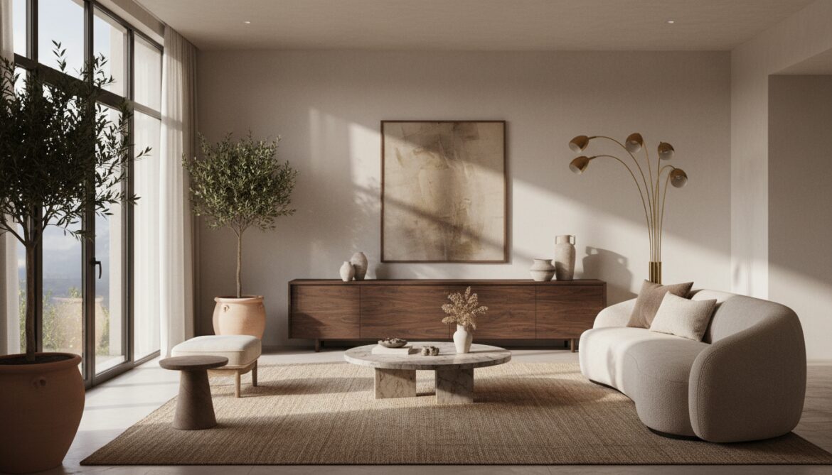
Heavy Victorian furniture eats light. MCM furniture lets light pass through it. The peg legs lift the bulk off the floor, exposing the floorboards underneath, which tricks your brain into thinking the room is massive. It is a spatial magic trick.
Real-World Application: How to Do It (Without Looking Like a Museum)
The goal is not to recreate a set from a 1960s sitcom. That feels sterile. The goal is to steal the principles of the era and apply them to how we actually live today.
Here is how you inject that timeless cool into a modern home without turning it into a caricature.
1. The Art of the Low Profile
MCM furniture sits low. Extremely low.
If you are dealing with standard 8-foot ceilings—or worse, the dreaded 7-footers found in many basements—this style is your savior. By keeping the visual weight of your sofas and sideboards below the waistline, you create a massive expanse of vertical negative space.
It fundamentally changes the volume of the room.
However, this creates a problem: vertical storage. If everything is low, where do you put your stuff? The mid-century solution was the wall unit (think Cado shelving). Today, you need to hack this. Use floor-to-ceiling shelving systems that mount directly to the wall studs. This draws the eye up, maximizing vertical real estate without consuming floor space.
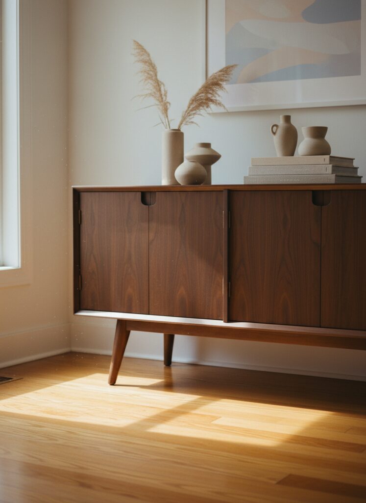
2. Wood Tones: The Real vs. The Fake
Nothing kills the vibe faster than printed laminate that is pretending to be walnut.
When you are hunting for pieces, you need to become a detective. You want solid wood or high-quality thick veneer. Run your hand under the table edge. Is it rough? Does the grain pattern abruptly stop? That’s cheap stuff.
MCM thrives on the warmth of teak, rosewood, and walnut. These warm tones act as a neutral base.
But here is the trick for the modern wallet: you don’t need to spend $5,000 on a vintage dresser. This is the perfect arena for High-Low design. Splurge on one “hero” piece, like a solid vintage coffee table that you touch every day. Then, mix it with hacked big-box store shelving.
If you swap the generic legs on an IKEA cabinet for tapered wooden ones and swap the hardware for brass, you have bridged the gap for a fraction of the cost.
For more about this topic, read: Make IKEA Furniture Look Custom Hacks
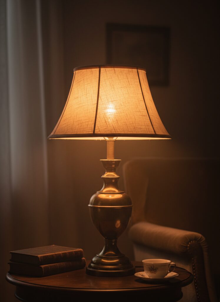
3. Lighting is Sculpture (The “Solitary Hero”)
In the 1950s, lighting stopped being just a utility and became art.
Think of the Sputnik chandelier or the Arco lamp. These aren’t just light sources; they are sculptural heavyweights. In a room that is otherwise minimal, a massive, weird, curved floor lamp acts as a “Solitary Hero” art piece. It commands attention.
But the quality of that light matters more than the fixture.
MCM interiors were designed for incandescent warmth. If you screw a 5000K “Daylight” blue-white LED bulb into a vintage lamp, you destroy the soul of the piece immediately. It looks like a hospital interrogation room.
You need warm white smart bulbs. I program mine to shift intensity throughout the day—bright for work, shifting to a deep, dim amber after sunset to support circadian rhythms. It mimics the glow of the mid-century hearth.
4. Navigating the Tech Minefield
Here is the biggest friction point: Ray Eames didn’t have a 65-inch 4K OLED TV or a tangle of HDMI cables.
MCM living rooms were oriented around conversation, the fireplace, or the view. A giant black rectangle ruins that flow.
I often recommend clients ditch the TV entirely for a projector. You can project onto a blank white wall or a retractable screen, preserving the aesthetic purity during the day. If you must have a TV, the console underneath needs to be a cable management fortress.
And those ugly smart speakers? Hide them. I’ve gutted broken vintage table radios and stuffed Google Nest minis inside the speaker grille. It looks authentic, but it plays Spotify.
5. Color and Texture: Beyond Avocado Green
People think MCM means orange, brown, and avocado. Please stop.
The actual mid-century palette included moody teals, mustard yellows, and even stark monochrome.
If you have a small space, try a monochromatic texture approach. Layer a beige boucle sofa against a cream rug and white oak tables. It’s distinctively “Japandi”—the modern evolution where Scandinavian functionality meets Japanese rusticity.
Or go dark.
Painting a ceiling charcoal or dark navy in a room with walnut furniture is a power move. It blurs the boundaries of the room. Combine that with the “60-30-10” color rule—60% neutral, 30% secondary (maybe a sage green or terracotta), and 10% punchy accent (brass or burnt orange)—to keep it balanced.
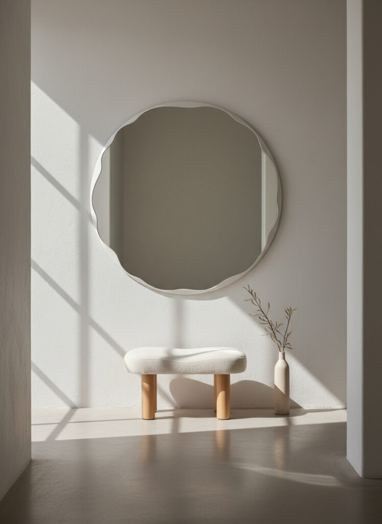
6. The Organic Curve
Mid-century architecture was boxy. Glass rectangles. Concrete slabs.
To fight that rigidity, designers introduced the kidney bean shape. Curved sofas, oval coffee tables, and round mirrors were antidotes to the sharp corners of the room.
If your apartment is a boring drywall box, you need curves. A round mirror doesn’t just check your reflection; it breaks the grid. It makes a tight hallway feel like a destination.
The “Mistake” Section: Where It Goes Wrong
I see people ruin this aesthetic constantly. Avoid these three traps.
1. The “Set Dressing” Trap Do not buy everything from the same era. A room full of 1950s furniture looks like an estate sale, not a home. You need friction. Put a weird, chunky 1970s rug under a sleek 1950s table. Throw some contemporary abstract art on the wall. Mix metals. If it looks too perfect, it looks cheap.
2. Ignoring Comfort for Style I love the look of a fiberglass shell chair. I have two. But sitting in one for an eight-hour workday? absolute torture. Ergonomics have come a long way since 1960. Do not sacrifice your lumbar spine for a vibe. If you work from home, get a human-centric ergonomic chair. You can blend it in, or acknowledge it as a tool. But don’t force yourself to suffer on a vintage wooden bench just because it looks pretty on Instagram.
3. Bad Scale MCM furniture is petite. If you live in a modern “McMansion” with soaring cathedral ceilings and massive open floor plans, vintage MCM pieces will look like dollhouse furniture. They will get swallowed. In those cases, you have to “float” the furniture in tight groupings away from the walls to create intimacy, or you need to buy modern reproductions that have been scaled up for larger American bodies and homes.
Sign-off
Buy the vintage lamp, but put a smart bulb in it—that’s the balance we are aiming for.