I used to be a total snob about flat-pack furniture.
Fifteen years ago, fresh out of design school, I thought “real” design meant hand-dovetailed joints and mahogany sourced from a specific forest in Brazil. I wouldn’t touch particleboard. I thought it was cheating. I thought it was cheap. But recently, I had an epiphany while staring at a five-figure invoice for custom millwork that looked suspiciously like a hacked Pax wardrobe.
Snobbery is expensive.
It’s also incredibly limiting. The truth is, the most interesting homes aren’t the ones where everything was bought from a high-end showroom; they are the homes where the owner had the grit to take something basic and force it to be interesting. IKEA is not the villain. It is the canvas. The problem isn’t the furniture itself; it’s that everyone assembles it, shoves it against a wall, and calls it a day. That is why your living room looks like a dentist’s waiting room.
We are going to fix that.
The Theory of the Hack
Why does a Billy bookcase look cheap?
It isn’t the material. It’s the shadows. Or rather, the lack of them.
Custom furniture has weight. It has specific dimensions that fit the architecture of the room perfectly. Mass-produced furniture is designed to fit any room, which means it fits no room perfectly. It floats weirdly. It has gaps. The finish is that distinctive, soulless semi-gloss that reflects light in a way that screams “factory.”
To make these pieces look high-end, you have to trick the eye. You have to disrupt the expected visual cues. This aligns perfectly with a high-low design philosophy. You spend money on the hardware, the lighting, and the paint, and you save on the carcass of the unit. You are essentially acting as the finishing carpenter for a project that was 80% done when you bought the box.
Step 1: The Paint Job (Do Not Skip The Primer)
If you take a brush with standard latex paint and slap it onto a laminate Kallax unit, you are going to have a bad time. The paint will bead up. It will scratch off if you look at it wrong.
You have to bridge the gap between plastic and pigment.
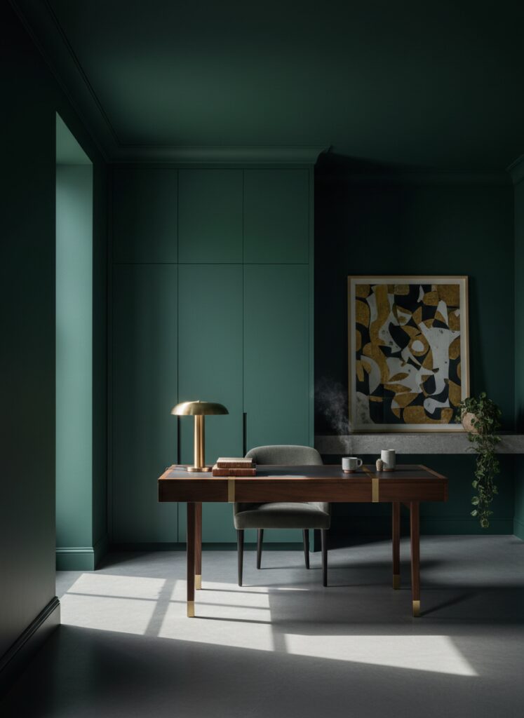
You need a shellac-based primer. It smells terrible. It is sticky. It is absolutely non-negotiable. Once you have that grip, you can introduce actual color theory into your space. Don’t just paint it white. White is safe, but “safe” rarely looks custom.
Consider the emotional weight of the room. If you are hacking a desk for a workspace, you might want to look into blue tones, which are fantastic for anxiety relief and focus. If you want something trendier and earthier, terracotta or sage green can ground a cheap piece of furniture and make it feel like an heirloom.
Another trick I love? Color drenching.
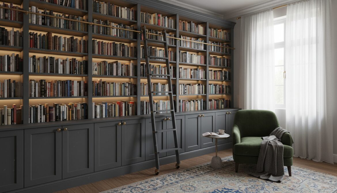
Paint the furniture the exact same color as the wall behind it. When a wardrobe matches the wall, it stops looking like a piece of furniture and starts looking like built-in architecture. If you are feeling bold, you can even carry this up to the ceiling. Dark ceiling paint is having a massive moment right now, and if your tall shelving units blend into a moody, dark ceiling, the room instantly doubles in perceived height and drama.
Step 2: Texture is the Antidote to “Flat”
The biggest giveaway of budget furniture is the flat, smooth, plasticky surface. It has no tactile quality.
Real wood has grain. Custom cabinetry often has molding. To break the “IKEA look,” you must add texture. This is where the Japandi trend—that moody mix of Japanese rusticity and Scandinavian function—really shines.
You can buy rolls of cane webbing or rattan online. Cut out the center panels of a Besta door, staple the cane webbing inside, and suddenly you have a breathable, organic piece that looks like it cost $2,000.
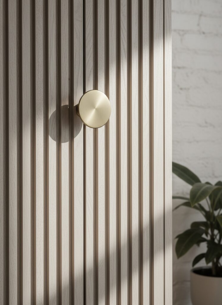
Another massive trend is fluting. You can buy half-round molding at the hardware store and glue it vertically across drawer fronts. This mimics the expensive, ribbed detailing you see in high-end hotels. It catches the light. It creates shadows. It breaks up the monotony.
This creates a monochromatic texture effect. Even if the piece is all one color, the play of light on the ridges creates visual interest that flat laminate can never achieve.
Step 3: Lighting Changes the Structure
You can build the most beautiful built-in unit, but if you light it with a single overhead boob light, it will look trashy.
Lighting is the difference between a warehouse and a boutique.
For shelving units (Billy or Pax), you need to integrate LED channels. Do not just stick a strip light to the underside of the shelf where the individual diodes are visible. That looks tacky. You need a diffuser channel.
Route out a groove or mount a 45-degree angle channel behind the face frame. The goal is to see the glow, not the light source.
Pay close attention to color temperature. A cool white (4000K+) will make your shelves look like a refrigerator display. You want a warm white (2700K to 3000K) to make the wood tones or paint colors feel rich and inviting.
If you are tech-savvy, integrate these into smart lighting scenes. I have my office set up so that when I walk in, the overheads stay off, but the backlights on my hacked storage units glow warmly. It creates a “wellness” vibe that makes working early mornings or late evenings much less miserable.
Step 4: The Built-In Illusion
Nothing looks more expensive than furniture that touches the wall.
Baseboards are the enemy here. They push your bookcase two inches away from the wall, creating that dreaded gap where dust bunnies and lost pens go to die.
If you are renting, you can build a small platform for the unit to sit on that clears the baseboard. If you own, remove the baseboard behind the unit. Anchor the unit to the wall. Then, add trim molding around the edges to seal the gap between the unit and the wall.
Caulk is your best friend.
Caulk every seam where the wood meets the wall. Once painted, the unit and the drywall become one organism. This is specifically effective for creating vertical storage. By taking the eye all the way up, you use wall space efficiently, which is a massive help in small apartments or studio layouts.
Step 5: Hardware and “Jewelry”
Throw away the knobs that came in the box. Just toss them.
The hardware is the jewelry of the room. It is the tactile point of contact. Touching a flimsy plastic handle subconsciously tells your brain “this is cheap.” Touching a heavy, knurled brass knob tells your brain “this is quality.”
However, scale matters.
Don’t put a tiny, delicate knob on a massive wardrobe door. It looks stingy. Go for long, substantial pulls. If you are doing a biophilic design with lots of plants and green tones, raw wood or leather pulls can look incredible. If you are going for a sleeker, moody maximalist vibe, polished nickel or matte black hardware creates a sharp contrast.
Step 6: Layout and Zoning Hacks
Sometimes, the “hack” isn’t about changing the furniture, but how you position it.
In a broken-plan living room, you can use a Kallax unit (turned on its side or standing tall) to act as a partition wall. But don’t just leave it open. Fill some cubes with baskets and leave others open for decor. This allows light to pass through while still defining the space.
For those of you in studio apartments, micro-zoning is the only way to stay sane. A floating Besta unit mounted on the wall can serve as a TV stand, but if you continue it into the next “zone,” it can become a bench for a dining table or a landing strip for a fake entryway.
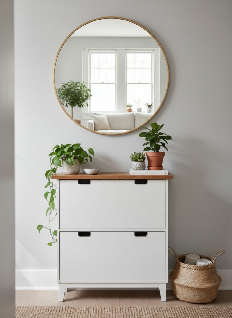
Speaking of entryways, if your front door opens directly into your living room, use a slim shoe cabinet (like the Hemnes or Stall) to create a “drop zone.” Add a mirror above it. Mirrors are the oldest trick in the book for making small, cramped corners feel spacious, and they reflect the light from your newly hacked lamps.
Step 7: Managing the Mess (Tech and Wires)
A custom unit looks ruined if there is a spaghetti monster of cables hanging off the back.
When you are assembling your units, cut holes in the back panels before you push them against the wall. Plan where your outlets are.
I am a huge advocate for hiding smart speakers and modems. You can put your router inside a cabinet, but keep in mind signal strength. If you have a mesh system, you can hide the nodes behind vintage books or in woven baskets that don’t block the signal.
For the home office, cable management is a sanity saver. Mount a tray to the underside of your desk. Run your cables down the leg of the desk using zip ties or clips. If you are mounting a TV or, even better, using a projector for a cleaner look, ensure the power sources are hidden inside your cabinetry.
The Mistakes Everyone Makes
I have seen many DIY attempts go sideways. Here is how to avoid ruining your weekend.
1. The “Eyeball” Method Do not eyeball the level. You are not a laser. If you are floating furniture, specifically in a small living room to keep the floor visible (which makes the room feel bigger), you need a spirit level. If you mount a sideboard crooked, it will haunt you every time you walk past it. It will drive you crazy.
2. Over-cluttering the Display You built these beautiful shelves. You added the lighting. Do not stuff them with 400 paperbacks and loose change. Follow the 60-30-10 rule for styling, or just leave some negative space. If you crowd the shelves, you lose the architectural effect you worked so hard to build. It just looks messy.
3. Ignoring the “Hand” of the Paint If you use a roller with a thick nap, your furniture will have the texture of an orange peel. You want a foam roller or a sprayer. You want that finish to be like glass (or a smooth matte). The texture should come from the wood or the cane, not from a bad paint job.
Go Break the Rules
You do not need a contractor to have a home that looks finished. You just need patience, a drill, and the willingness to void a warranty or two.
The best interiors are the ones where the owner took control. Don’t settle for the showroom default. It’s boring, and you deserve better.
Grab the sandpaper.