I used to roll my eyes at the term “ergonomics.”
It conjured images of those hideous, alien-looking kneeling chairs or generic grey cubicles that smell like despair and stale coffee. For the longest time, I prioritized the photo over the feeling. I would style a vintage wooden chair at a reclaimed oak desk because it looked incredible in a portfolio shot. But let’s be honest. Sitting in that chair for eight hours was torture. It was a beautiful torture, but my lumbar spine didn’t care about the aesthetic integrity of mid-century modern design.
We spent the last few years obsessing over our video call backdrops. We curated fake bookshelves, bought ring lights that burned our retinas, and staged our lives for a webcam lens. That era is over.
I am officially calling time of death on the “Zoom Room.”
The future isn’t about how your office looks to other people; it’s about how the space physically interacts with your body while maintaining a vibe that doesn’t scream “corporate drone.” We are seeing a massive shift toward soft ergonomics. This is where high-performance function hides inside organic, comforting design.
The Marriage of Comfort and “Mood”
Why does this matter now? Because we are tired.
Collectively, we are exhausted by the sharp edges of modern technology. We want our homes to feel like homes again, even if we are working in them. The stark, white minimalist office is being replaced by something moodier, softer, and infinitely more tactile.
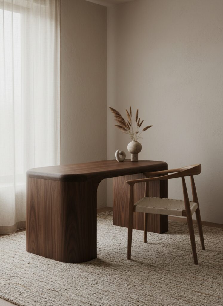
Think about the texture of your desk. Is it cold laminate? Or is it a warm walnut with a matte finish that feels good under your forearms?
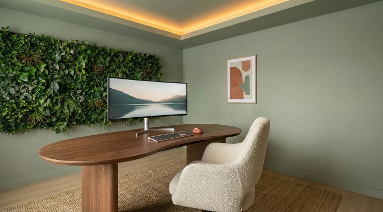
We are seeing a move toward Japandi design evolution, specifically leaning into a “moody minimalism.” It’s not just about beige anymore. It is about creating a cockpit of focus that holds you. The furniture needs to hug you back. We are seeing a surge in curved furniture—kidney-shaped desks and rounded chairs—which aligns perfectly with organic interior design principles. Sharp corners create visual tension. Curves create flow. When you are stressed about a deadline, the last thing you need is a room full of aggressive angles.
Designing the Ecosystem: Practical Application
You cannot just buy a new chair and call it a day. You have to design the ecosystem. This involves lighting, layout, and the invisible architecture of the room.
1. Lighting is Biology, Not Decoration
Most people get this wrong. They buy a lamp because the base is pretty.
Stop doing that.
You need to think about light temperature as a tool for your brain chemistry. If you sit in a room with yellow, dim lighting all day, you will feel sluggish. If you blast yourself with hospital-grade blue light at 8 PM, you will never sleep.
You need to implement smart lighting scenes that shift throughout the day. I have my office programmed to mimic the sun. In the morning, it is a crisp, bright white to spike cortisol and wake me up. As the afternoon hits, it transitions. By 5 PM, my office is glowing with warm ambers.
If you struggle with stress, look into blue interior design elements or lighting accents, as specific shades of blue are proven to help with anxiety relief. But be careful with the bulbs—understand the difference between warm vs. cool white lightbulb temperatures. It is the single most important factor in whether your office feels like a sanctuary or an interrogation room.
2. The Color of Focus
White walls are boring. They are also terrible for focus because they bounce light around in a way that fatigues the eye.
I am currently obsessed with terracotta and sage green. These earth tones ground you. They feel permanent. If you want to go bolder, look at the dark ceiling paint color trends. Painting your ceiling a charcoal or deep navy creates a cozy, enclosed feeling—almost like a library. It stops your eye from wandering up and keeps your focus on the work in front of you.
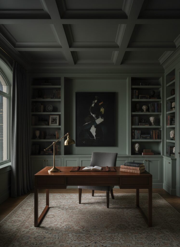
However, you must balance this. Use the 60-30-10 rule. 60% dominant color (maybe that sage green), 30% secondary (a natural wood tone), and 10% accent (brass or matte black). Without this structure, a moody room just looks messy.
3. The “Un-Office” Layout for Small Spaces
If you are a renter in a studio, you don’t have a spare room. You have a corner.
You need to master micro-zoning. You have to psychologically separate “work” from “sleep” even if they happen three feet apart. Do not just shove a desk against a wall. Try floating furniture. Pull the desk out into the room and put a rug under it. That rug is now your office boundary.
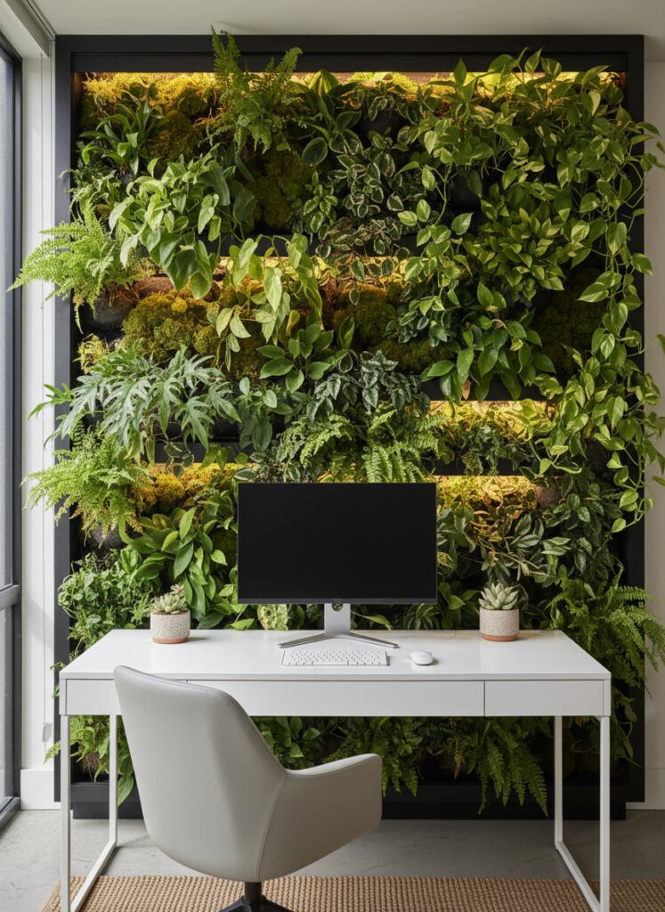
For those in truly tight quarters, consider a broken-plan living room layout. Use open shelving or a plant wall to create a partition that lets light through but blocks the view of your unmade bed while you are working. Speaking of plants, biophilic design is not going anywhere. We are moving toward “living walls” as a standard for 2026. A wall of green behind your monitor reduces eye strain and dampens sound.
4. Hiding the ugliness
Technology is ugly. There is no way around it. Routers, modems, and cables are visual clutter that creates mental clutter.
You have to get aggressive with cable management. I don’t mean just tying them up. I mean routing them inside the legs of your desk or painting the cable covers the exact same color as your wall.
And what about the speakers? Those black plastic blobs ruin a vintage aesthetic. I love the trend of hiding smart speakers within vintage decor. Put that Google Home inside a hollowed-out stack of antique books or behind a ceramic vase.
If you hate the look of a giant black monitor dominating your room when you aren’t working, have you considered a projector? Projector vs. TV setups are becoming viable for work, especially for creative types who need massive screen real estate but want it to disappear when the work is done.
5. Texture is the Secret Weapon
If your color palette is limited—say, you love monochrome—you risk the room feeling flat. You need to master texture in monochromatic interior design.
Combine a velvet chair with a boucle rug and a smooth wooden desk. The friction between these materials creates visual interest without screaming for attention. It makes the space feel expensive and layered.
Where People Screw This Up
I see the same three mistakes over and over again. It drives me crazy because they are so easy to fix.
1. Ignoring Vertical Real Estate You run out of floor space and assume you are out of room. You aren’t. You have walls. Vertical storage secrets are the key to a functional home office. Get shelves up high for the stuff you don’t use daily. Use pegboards. If you don’t look up, you are wasting 50% of your room.
2. The Wrong Kind of “Cozy” There is a fine line between “moody maximalism” and a hoarding problem. Moody maximalism in a small apartment requires strict curation. If you have too many knick-knacks on your desk, your brain creates a background process to track them. It is distracting. Keep the desk surface clear.
3. Ignoring Renter Restrictions You think you can’t change the lighting because you rent. Wrong. There are so many renter-friendly lighting hacks. Swap the fixtures and keep the old ones in a box. Use battery-operated sconces. Use smart bulbs. Never accept the landlord’s “boob light” as your destiny.
Another quick trick? Mirrors. If your office feels like a closet, a strategically placed mirror can make a small room look bigger and bounce natural light onto your desk. Just don’t place it where you have to stare at yourself all day. Nobody needs that much self-reflection on a Tuesday.
Make It Yours
The era of the showroom office is done.
Nobody cares if your workspace looks like a page from a catalog if it hurts to sit in it. Prioritize your spine, your eyes, and your sanity. Buy the ergonomic chair, but maybe get it in a weird color. Paint the ceiling black. Hide the wires like your life depends on it.
Your home office should be the one place where you feel completely in control. If it’s not working for you, change it. Tonight.