The Tyranny of the Rectangle is Over
I have a scar on my left shin. It’s a souvenir from 2014, courtesy of a low-slung, incredibly sharp teak coffee table that I swore I loved.
For the longest time, I worshipped at the altar of the right angle.
We all did, didn’t we? We convinced ourselves that “modern” meant rigid. We equated clean lines with moral superiority, treating our living rooms like geometry equations that needed to be solved. If it wasn’t a square, a rectangle, or a perfect cube, it was messy. It was clutter.
But recently, something shifted in the atmosphere.
Maybe it’s because we’ve spent too much time staring at the four walls of our apartments, feeling the walls close in like a trash compactor. We realized that living inside a box, filled with smaller boxes (sofas) and even smaller boxes (bookshelves), feels less like a sanctuary and more like a storage unit.
We got tired of the bruises. We got tired of the visual rigidity.
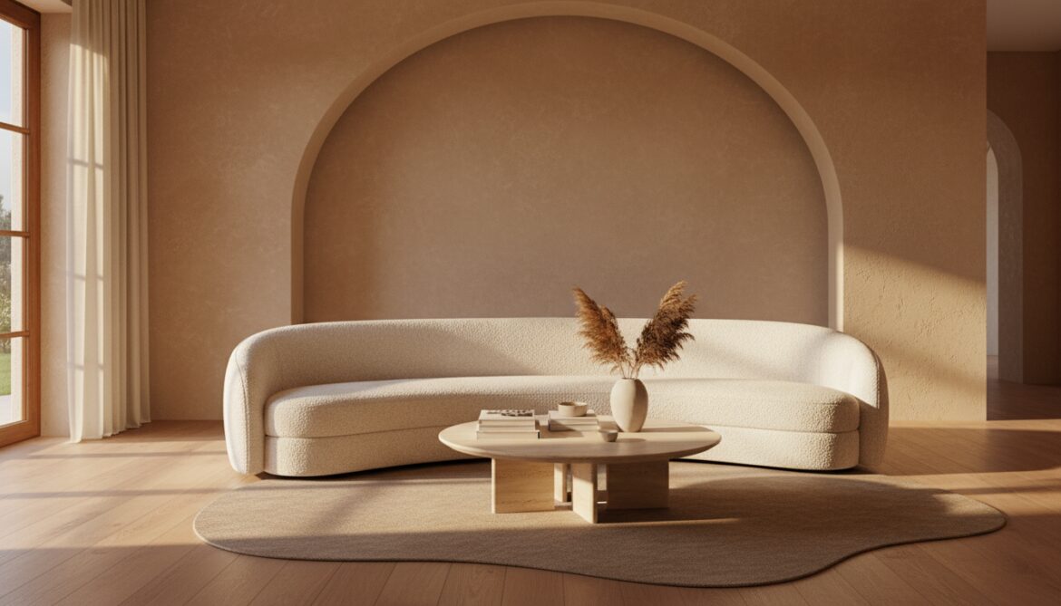
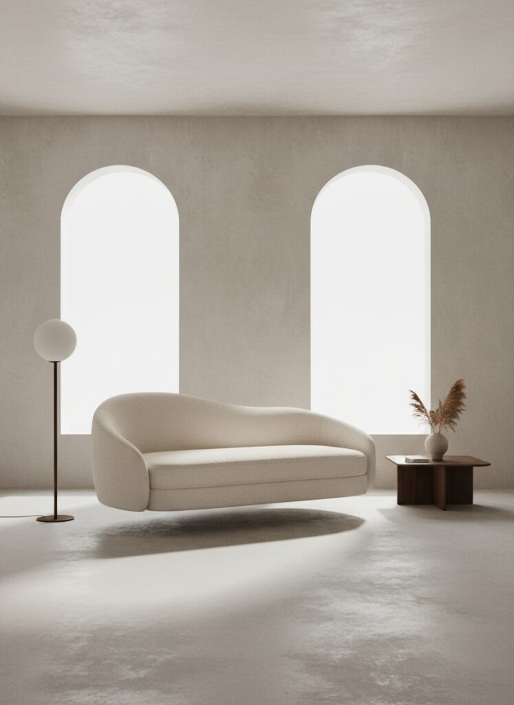
The curve is back. And this time, it isn’t the kitschy, inflatable aesthetic of the 1970s or the excessive ornamentation of the Victorian era. It is sculptural, deliberate, and undeniably necessary.
Why Your Brain Craves the Curve
Let’s get a little scientific, but not boringly so.
Humans are hardwired to view sharp objects as threats. It’s evolutionary baggage. A jagged rock? Danger. A sharp tooth? Predator. A pointy stick? Weapon.
When you walk into a room filled with spikes and corners, your amygdala—the lizard part of your brain—stays on low-level alert. You might not consciously feel fear when looking at your rectangular dining table, but your body doesn’t fully relax either.
Curves, on the other hand, signal safety. They mimic the organic shapes found in nature.
Think about the human body. Think about river stones. Think about the horizon.
This psychological response is deeply tied to the rise of biophilic design. We aren’t just adding plants to corners anymore; we are trying to replicate the flow of the outdoors. Nature rarely produces a perfect 90-degree angle. By bringing archways, rounded sofas, and circular rugs into our homes, we are tricking our brains into thinking we are in a more natural, less manufactured environment.
It softens the harshness of the architecture.
Most of us, especially renters, are stuck in drywall cubes. We cannot knock down walls or vault ceilings. The architecture is rigid. The furniture is the only rebellion we have left against the grid.
How to Actually Do This (Without Your House Looking Like a Spaceship)
Okay, you’re sold on the concept. You want softness. But if you just buy a bunch of round things and toss them into a room, it’s going to look chaotic. You need a strategy.
Here is the deep dive on applying this, room by room, texture by texture.
1. The “Kidney” Sofa and The Conversation Circle
The straight-backed sectional pushes everyone against the wall. It lines you up like birds on a wire, facing a television. It kills conversation.
The curved sofa—often kidney-bean shaped or a gentle “C”—changes the social dynamic entirely. It forces people to angle toward one another. It creates an embrace.
However, placing these is tricky. You cannot shove a curved sofa into a corner. It looks ridiculous. These pieces demand to breathe. This ties directly into the concept of floating furniture layouts. You have to pull the piece away from the wall. Let the curve carve out a pathway behind it.
If you are dealing with a tight floor plan, this actually works in your favor. A curved back allows traffic to flow around the seating area smoothly, rather than hitting the hard corner of a tuxedo sofa.
2. Zoning Without Walls (The Broken Plan)
Open concept is great until you realize you can hear the dishwasher while you’re trying to watch a movie. We are moving toward broken-plan living, where we use furniture to define zones rather than drywall.
Curves are the absolute best tool for this.
Imagine a rectangular rug. It creates a hard border. It says, “The living room stops HERE.”
Now imagine an irregular, organic-shaped rug. The edge is fluid. It creates a vague suggestion of a zone rather than a border patrol checkpoint. Use a curved console table behind your floating sofa to act as a soft partition between your “entryway” and your lounge space.
If you are in a studio, this is your lifeline for micro-zoning. A round dining table tucked into a nook distinguishes the “eating zone” from the “sleeping zone” much better than a square table, which will inevitably align with a wall and look like a desk.
3. The Vertical soften: Arches and Mirrors
If you can’t renovate, you have to fake the architecture.
The easiest way to introduce curves isn’t furniture; it’s mirrors. A standard rectangular mirror reflects the room. An arched mirror or an amorphous “pond” mirror acts like a window. It breaks the grid of the wall.
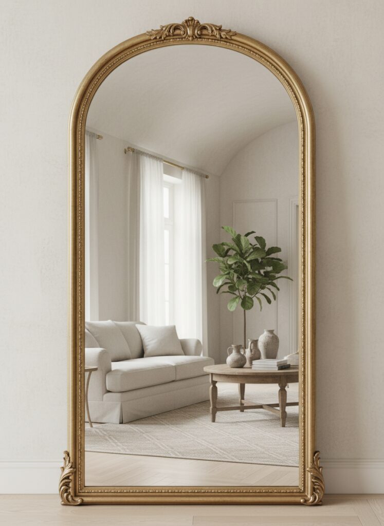
When you are trying to make a small room look bigger, the shape of the mirror matters as much as the size. A round mirror confuses the eye just enough to make the strict boundaries of the corner disappear.
Pair this with vertical storage that avoids the locker-room aesthetic. Look for bookshelves with arched tops or reed detailing. The goal is to draw the eye up a curved line, rather than a ladder.
4. Lighting is the Jewelry of the Room
Please, for the love of design, stop buying industrial cage lights.
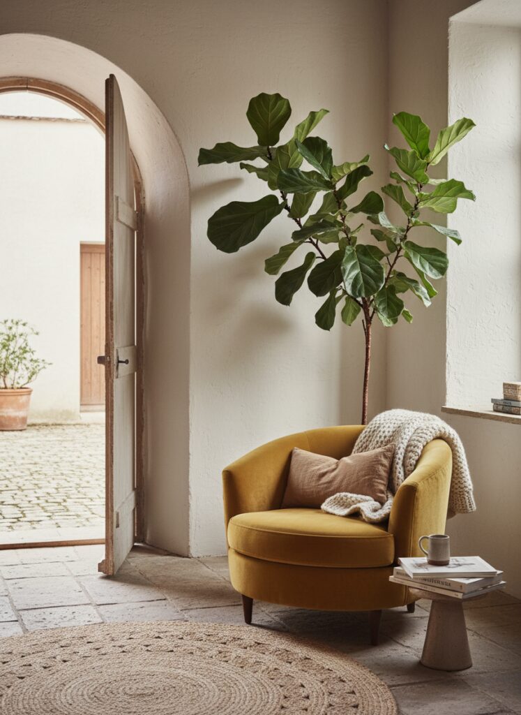
If your furniture is square, your lighting must be round. It is the yin to the yang. Think oversized paper lanterns, globe pendants, or mushroom lamps.
Lighting is often the most renter-friendly change you can make. Swapping out a harsh, angular fixture for a frosted glass globe creates a diffused glow that softens the hard shadows in the room. Hard shadows emphasize corners; soft light blurs them.
In a moody maximalist space, this is where you can get weird. Go for gloopy, melting shapes. Go for chandeliers that look like dripping wax or bubbles. This is where you inject personality.
5. The Material Matters
A curve in a cold material (like metal or glass) feels futuristic. A curve in a warm material (wood, wool, velvet) feels cozy.
We are seeing a massive resurgence in darker woods and textured fabrics because they ground these floating shapes.
If you are looking into Japandi design, you are looking for light oaks and boucle fabrics wrapped around soft forms. But if you want something grittier, look for walnut and velvet.
The texture creates shadow play on the curve. Flat fabric on a round sofa looks cheap. Bouclé, corduroy, or mohair catches the light at different points of the curve, giving the piece volume and weight.
Where People Get It Wrong (The “Blob” Effect)
I have seen this trend go horribly wrong. It happens fast.
Mistake #1: The Scale Fail Curved furniture is deceptive. It looks smaller in the store because it lacks corners. You think it will fit in your walk-up apartment.
It won’t.
Curved sofas are often deeper than straight ones. They eat up floor space in the center of the room. Before you buy, tape it out on the floor. If you have a narrow living room, a massive curved sectional will choke the flow, not help it.
Mistake #2: The “Blob” Overload If your sofa is curved, your coffee table is round, your rug is oval, and your pillows are spheres, you are living in a ball pit.
You need contrast.
If the sofa is curvy, get a coffee table with a bit of edge—maybe a hexagon or a raw-edge wood piece. If the architecture is super rigid, then you can go heavier on the round furniture. It is about balance. You need a few straight lines to make the curves look intentional.
Mistake #3: Ignoring Function for Form Round bedside tables look cute. They are terrible at holding things. You lose surface area.
Curved sofas are incredible for cocktails. They are terrible for napping. You cannot stretch out fully without sliding off the edge.
When shopping sustainable furniture brands, ask yourself: “Do I want to look at this, or do I want to live on it?” If you are a maximize-the-coziness person, a curved sofa might frustrate you on a Sunday afternoon.
Mistake #4: The “Fake Entryway” Flop People try to create a fake entryway using a round table in the middle of a thoroughfare.
Unless you have a foyer the size of a ballroom, a round table in the middle of the door swing is just an obstacle. Use a demi-lune (half-moon) console against the wall instead. It gives you the curve without the bruise.
The Financial Reality of the Curve
Here is the annoying truth: Curves cost more.
Manufacturing a straight line is easy. You cut the wood. You glue it. Done.
Bending wood? creating a frame that supports a serpentine back? That requires skilled labor and more material waste. That is why that vintage curved velvet armchair is so expensive, and why the cheap mass-market version feels like cardboard covered in foam.
If you are on a budget, don’t buy the cheap curved sofa. It will sag.
Instead, invest in the accessories. Get the round rug. Get the arched mirror. Get the sculptural lamp. Keep your reliable, rectangular, high-quality sofa and soften it with round pillows and a throw blanket draped in a messy, organic way.
A Soft Conclusion
The world outside is sharp enough. It’s chaotic, loud, and demanding.
Your home doesn’t need to challenge you. It doesn’t need to be a manifesto of intellectual design. It just needs to hold you.
So, ditch the pointy coffee table. Your shins will thank you, and frankly, so will your brain.