Let’s be honest for a second.
“Trust your intuition” is terrible advice.
I hear it all the time in this industry. Designers love to tell you to just “feel” the space, as if you’re going to walk into an empty living room, close your eyes, and magically download a perfect color palette from the ether. That is not how this works. For fifteen years, I have watched intelligent, capable homeowners turn their living rooms into what looks like a Skittles factory explosion because they trusted their gut instead of basic math.
Design is art, sure, but it is also a formula.
If you have ever looked at a room on Pinterest and thought, “Why does that look so pulled together while my room looks like a waiting room at a dentist’s office?” the answer isn’t money. It isn’t architecture. It is the distribution of color weight.
You need a framework. You need the 60-30-10 rule.
What is the 60-30-10 Rule?
It sounds rigid. I know you might be thinking that rules are meant to be broken, and eventually, they are. But you have to master the rules before you can break them effectively.
Think of a man in a business suit.
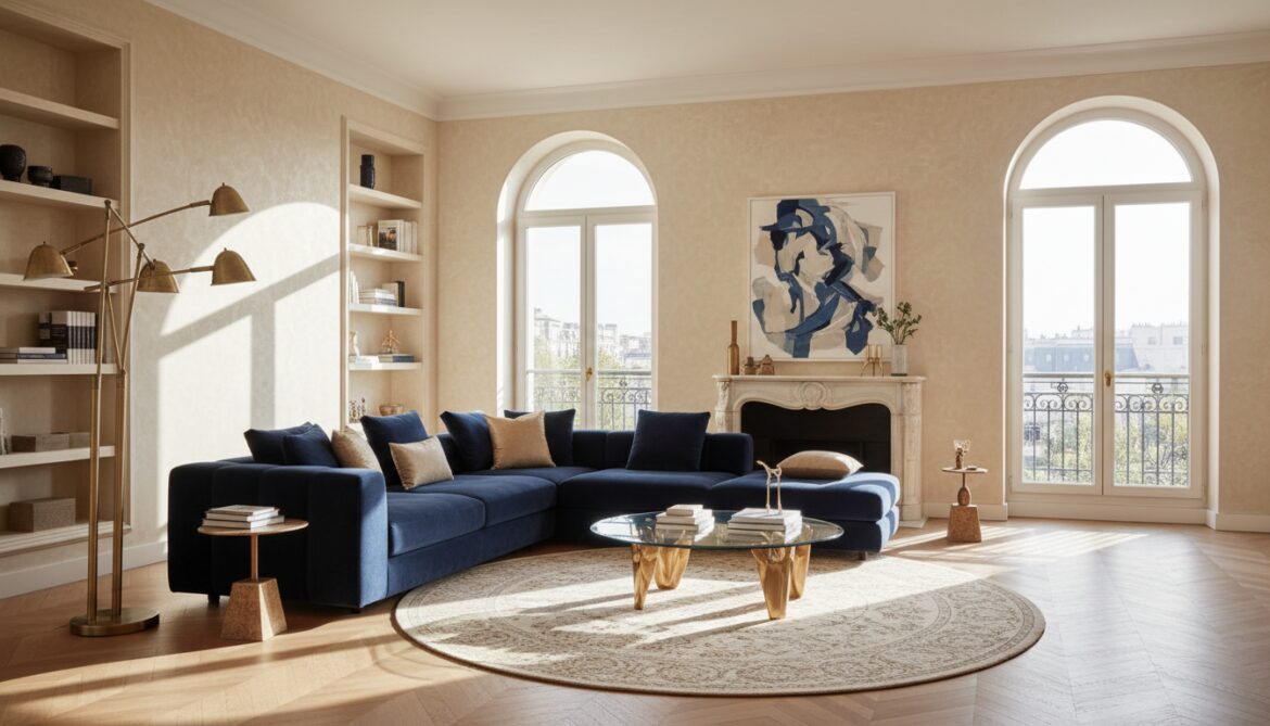
The trousers and jacket are the 60%. That’s the main color. The crisp white shirt underneath? That is the 30%. The patterned tie? That is the 10%. If he wore a bright red suit with a white tie and a navy shirt, he wouldn’t look sharp; he would look like a Batman villain.
The breakdown works like this:
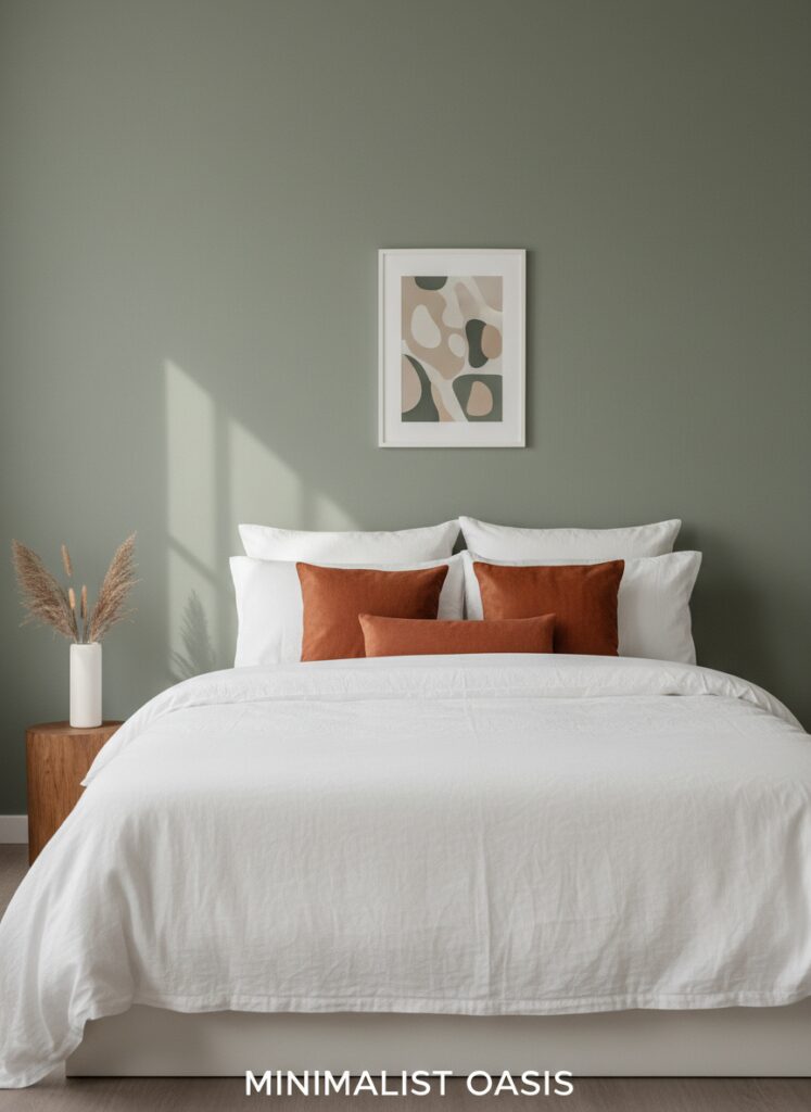
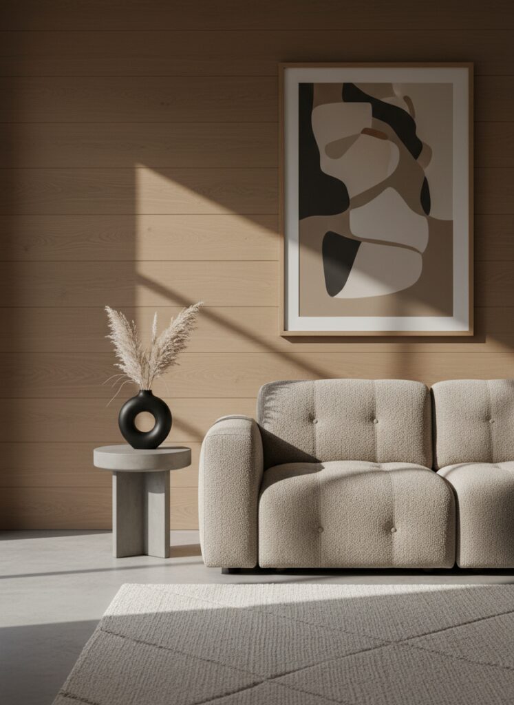
- 60% is your dominant color. This is the background for everything else. It anchors the space.
- 30% is your secondary color. It supports the dominant color but is different enough to set them apart. It creates interest.
- 10% is your accent color. This is the jewelry. The spice. The thing that prevents the room from boring you to tears.
Why does this specific ratio work? Because human brains are lazy. We crave order. When you walk into a room where colors are fighting for equal attention—say, 33% red, 33% blue, and 33% yellow—your brain doesn’t know where to look. It gets anxious. The 60-30-10 rule creates a hierarchy that tells your eyes exactly where to go.
The 60%: Setting the Stage Without Boring Yourself to Death
This is usually your walls, your area rugs, and your largest furniture pieces.
If you are renting, this color is often dictated by the landlord. We all know that specific, soul-crushing shade of “Rental White” or “Beige-Grey.” But don’t despair. If you can’t paint the walls, you have to overwhelm that vertical space with things you can control.
If your walls are white, and you hate white, you can’t just ignore them. You have to lean into it or distract from it.
The Sofa Dilemma Your sofa is likely the biggest investment in the room. If you buy a bright purple sofa, guess what? Purple is now your 60%. You are committed. That is fine if you love purple, but it makes changing the vibe later very expensive. This is why I almost always suggest looking at sustainable furniture brands that offer high-quality neutrals for the big pieces. You want longevity here.
However, “neutral” does not mean boring.
Texture is a color. A flat beige wall reads differently than a nubby, oatmeal-colored bouclé sofa. If you are doing a monochromatic look—which is very trendy right now with the whole Japandi design evolution moving toward moody minimalism—your 60% needs to be a mix of textures, or it will look flat.
The 30%: The Heavy Lifters
This is where the personality starts to bleed in.
The 30% usually consists of curtains, side chairs, painted furniture, or an accent wall. It shouldn’t clash with the 60%; it should support it.
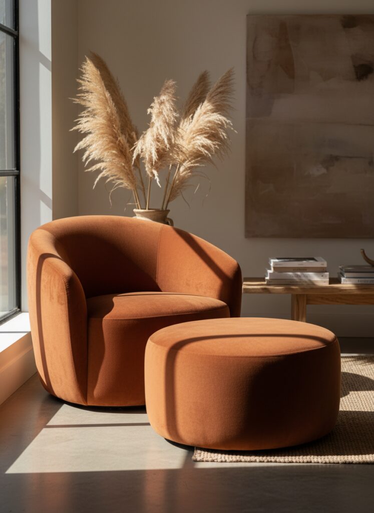
Using Shape as Color Weight Sometimes, the “weight” of a piece isn’t just about its hue. It’s about how much visual space it consumes. A blocky, rectangular armchair feels heavier than something airy. This is why I’ve been pushing curved furniture lately. Organic shapes tend to soften the transition between your primary and secondary colors. A rust-colored velvet chair with a curved back feels less aggressive against a cream wall than a sharp, square, bright orange box.
The Separation of Space If you are in a studio apartment, your 30% is your best tool for micro-zoning. You might use a sage green rug and matching throw blankets to designate the “sleeping” area, distinct from the neutrals of the “living” area.
In larger homes with an open concept, or a “broken plan” living room layout where shelves or partial walls divide the space, the 30% color helps bridge the gap. It carries your eye from the kitchen to the lounge without stopping abruptly.
The 10%: The Jewelry (and Where Everyone Messes Up)
This is the fun part. Throw pillows, artwork, lamps, vases, and trinkets.
Because it is only 10%, you can afford to be trendy here. You can buy that weird, neon sculptural candle. If you get sick of it in six months, you haven’t repainted a room or reupholstered a sofa. You just move it to the closet.
The Biophilic loophole I get asked constantly: “Does a houseplant count as green?” Yes and no. In a strict color theory sense, yes. Green is a color. But in 2024 and looking ahead to 2026 trends, biophilic design and living walls operate almost as a neutral. We expect plants to be there. However, if you have a black and white room and you add a massive fiddle leaf fig, that green is absolutely your 10% accent. If you want another accent color, say, terracotta, you have to be careful that the green of the plant doesn’t fight it.
Lighting is the Secret Sauce You can pick the perfect paint chips, but if your lighting sucks, the colors will look wrong. Period.
I have seen gorgeous, deep navy accents turn into muddy black holes because the homeowner bought the wrong lightbulbs. You have to understand the difference between warm vs cool white lightbulb temperature. A cool, blue-tinted LED will strip the warmth right out of your wood tones (your 30%) and make your cozy living room feel like a hospital operating theatre.
If you are a renter and stuck with those horrible overhead “boob lights,” don’t just live with it. Use renter-friendly lighting hacks to layer in lamps that let your accent colors actually shine.
Implementing the Rule: Real Scenarios
Let’s apply this to some difficult layouts.
1. The “Fake” Entryway You open your front door and you are immediately in the living room. It’s awkward. You need to create a landing strip. If your living room is 60% Grey and 30% Navy, use your “fake” entryway living room ideas to introduce a console table in a wood tone that matches your 10% accent. It creates a visual stop sign. It tells people, “This is a different zone.”
2. The Small, Boxy Room In a tiny space, people are terrified of dark colors. They shouldn’t be. A moody maximalism approach in a small apartment can actually blur the corners of the room. If you paint the walls (60%) a dark charcoal, and use mirrors to make the small room look bigger, the mirrors reflect the dark walls, creating depth. Your 30% could be rich jewel tones in the bedding or rug, and the 10% could be brass hardware.
3. The Floating Layout If you have a floating furniture layout in a small living room—meaning your sofa isn’t pushed against the wall—the back of your sofa becomes a major color block. It is now visually part of the wall space. Make sure the back of that sofa (part of your 60 or 30) looks good against the wall color.
The Top 3 Mistakes People Make
You have the formula. Here is how you are going to wreck it if you aren’t careful.
Mistake #1: Being Too Matchy-Matchy Your 10% accent is yellow. So you buy yellow pillows. And a yellow vase. And a yellow rug. And a yellow painting. Stop it. That isn’t designed; that is a catalogue page from 1998. The 10% shouldn’t be identical. It should be a family of colors. Use mustard, gold, ochre, and maybe a pale lemon. Layer the tones. It feels curated, not forced.
Mistake #2: Ignoring the “Fourth” Color Wood is a color. Metal is a color. If you have a room that is White (60), Blue (30), and Pink (10), but you also have hardwood floors, a wooden coffee table, and a wooden media console… you have broken the math. That wood is probably orange or yellow undertoned. It is taking up 20% of the visual space. You need to account for the fixed elements of the room. If you have honey-oak floors, honey-yellow is already in your palette whether you like it or not.
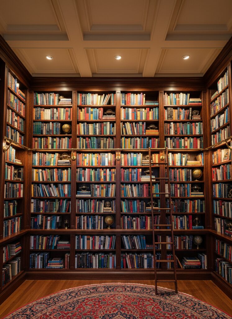
Mistake #3: Vertical Neglect People put all their color on the floor. Rugs, sofas, low tables. Then they have 8 feet of blank white walls up to the ceiling. It makes the room feel bottom-heavy and short. You need to drag the eye up. Use vertical storage secrets to get color up high. Bookshelves are amazing for this. The spines of the books can be your 10% accent scattered all the way to the ceiling. It balances the visual weight of the room.
A Final Thought
The 60-30-10 rule is a safety net. It is there to keep you from buying things that don’t fit.
But once you live in the space, you might find you want 60-30-10-5-5. That is fine. The goal isn’t to live in a math equation; the goal is to live in a house that doesn’t give you a headache.
Start with the ratio. Get the bones right. Then, and only then, can you get weird with it.